We've collated six of the best examples of information architecture from across the web to inspire your next website project.
Intro
Getting the information architecture (IA) right is probably the single most important step in designing an effective website. A well-designed information architecture means your users can find the information they need. It provides the structure for your entire site, so you need to develop your IA early on in any website project.
A great IA is simple, not flashy. It’s a lot like plumbing, when it all works as it should, you don’t have to think about it. It’s only when something is wrong that you notice it. That means the best IAs don’t exactly ‘stand out’, they simply do their job extremely effectively.
The larger your website, the more important it is to get the information architecture right. Complex websites need an intuitive structure to make them navigable. That makes IA particularly important for institutions like universities, large charitable foundations, public bodies, museums and any organisations who’ve developed big digital estates over time.
To help you understand more about what makes for effective information architecture, and provide inspiration for your projects, we’ve collated some of the best information architectures from around the web.
Harvard

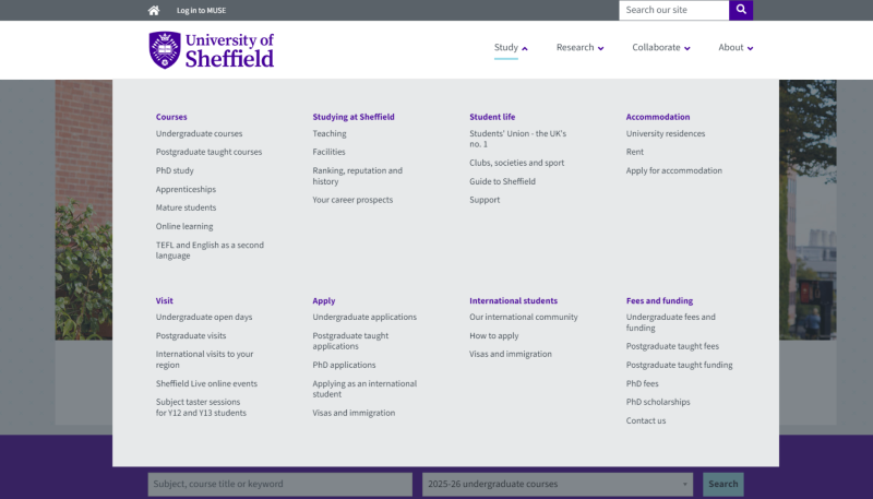
University of Sheffield
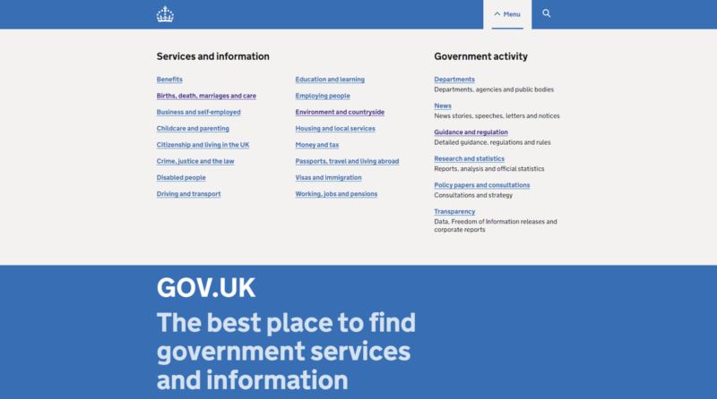
Gov.uk
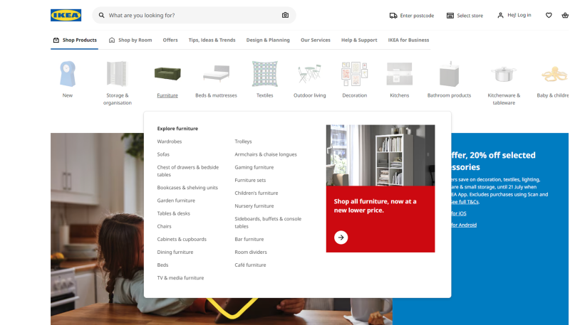
IKEA
Cancer Research UK

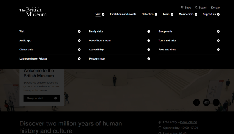
British Museum