Data can demonstrate how your organisation in performing, but past a certain scale, can be hard for users to appreciate. Data visualisation can make statistics more engaging and easier for users to understand.
Intro
How do you prove your value as an organisation? How do you go about helping people understand the challenges you face, the actions you take and the changes you make in the world? If you’re a large organisation — national, or maybe even global — then statistics, numbers and data are necessarily part of the answer.
Statistics quantify impact, and almost all organisations use them to prove their impact. For example, WaterAid tell us that right now, all around the world, some 700,000,000 people live without clean water close to home.
Similarly, the Eden Project’s website tells users that it played host to 25,327 visitors and learners in 2022/23, and received £50,000,000 from the Government’s Levelling Up fund.
These are astounding numbers. But at the same time, they’re somehow so big that they become abstract and incomprehensible — which is a problem!
Large numbers are hard to comprehend
There’s a paradox here: the bigger, the more important and more impressive your numbers, the harder they are for your audience to really connect with, empathise with, and understand. There’s a quote that neatly illustrates the problem:
One death is a tragedy, a million is a statistic.
As humans, we celebrate individual stories of success and rally around identifiable people in need, but find it difficult to emotionally process large numbers and values without context. See, for example, how months of news coverage about thousands of asylum seekers drowning in the Channel were largely ignored, but photos of a single boy — Alan Kurdi — being carried from the sea generated huge amounts of sympathy and fundraising.
And the same is true of any large numbers. 25,000 learners or 500,000 water pumps installed are both amazing achievements, but the phenomenon of psychic numbing makes them less effective as tools to communicate impact. Our brains simply can’t handle empathy on this scale. We struggle to grasp the idea of a million people, and even when we try the idea of that much emotion can be overwhelming, leading to an unconscious shutting-down.
There is undeniably value in statistics, but how can we turn these numbers into something that people can connect to?
Humanise the data
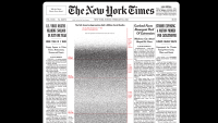
In early 2021 the death toll from COVID in the US passed 500,000 — a number that the New York Times described as “unfathomable” in a front-page article. Alongside the text, the NYT published a piece of data visualisation designed to bring some human context to the number.
The image is powerful — a rectangle containing 500,000 dots, each representing a life lost. It makes the number vividly, powerfully, real — it’s a striking image that makes you realise just how large that number is.
At the other end of the scale, Dollar Street is a project that explores the income, lives, and houses of people around the world, from a family in Burundi who live on $27 a month to a well-off Chinese family who bring in over $10,000. Each family’s life is shown through a gallery of photos and videos that provide a window into their lives, turning what could have been a dry set of statistics about income and spending into a compelling glimpse of family life around the world.
Provide context
Sometimes visualising a single number is enough, but it can also be powerful to put multiple numbers into a wider context. That might mean showing the bigger picture, or comparing bigger or smaller values to help you get a sense of what a number really represents, but either way data visualisation is excellent at creating those “aha!” moments.
For most people, a million pounds is a vast, almost unimaginable amount of money. And a billion pounds — or a trillion — is even more mind-boggling. When you hear that the NHS England budget for ‘24 is £179,600,000,000, or that tax increases could raise £100,000,000,000, it’s very hard to understand what those numbers mean.
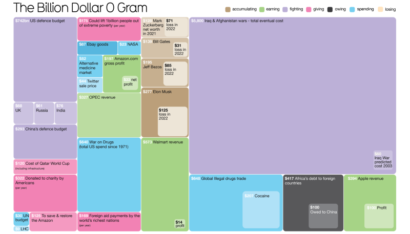
The Billion Dollar O Gram by Information is Beautiful does a great job of contextualising these colossal figures into a tree-map — a visualisation that represents values as rectangles of various sizes. It’s an engaging, exploratory piece that you can really pore over. Notice, for example, the “total cost of the Iraq war” block that dwarfs the smaller “predicted cost of the Iraq war” — a story told in two blocks.
But the real aha moment comes next. In the book, this diagram is laid out over two double-page spreads, and you turn the page to see one rectangle that covers two whole pages, representing the colossal global cost of the 2008 financial crisis.
The static version of this data visualisation is powerful, and interactive versions can be even more so. Creating visualisations that can be searched, filtered and explored, revealing data in layers makes them easier to use and avoids overwhelming the user with too much information at once.
Show, don’t tell
Here’s a ground-breaking piece of data visualisation from 1854, created by a man called John Snow.
In the 1800s the prevailing theory of disease was that it spread through “miasmas” — bad air, or bad smells — but Snow thought differently. He was investigating a mysterious outbreak of cholera in London, and decided to plot every case he could find onto a map. While this might seem obvious to us in 2024, this was a stroke of genius at the time, and as Snow populated his map it revealed something new: a pattern.
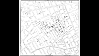
The map revealed that cases were clustered around a specific water pump, and Snow suggested that the cholera might, in fact, be spread by water. He persuaded the council to remove the handle from the pump to prevent its use, and cases plummeted — a victory for public health, and a clear demonstration of the power of data visualisation to uncover hidden trends and stories.
This simple approach is something that we can use to great effect by laying out the data and letting your audience discover the meaning on their own. A great piece that does this is The 598 People, Places and Things Donald Trump Has Insulted on Twitter by the New York Times. It’s a visualisation only in the loosest sense of the word — a list of tweets, presented with the bare minimum of context. The idea here, rather than editorialising the data, is to present hundreds of individual data points as a cohesive big picture and let people spot the pattern for themselves, much as John Snow did.
Tell stories with numbers
Presenting the data directly can be very effective. But data literacy varies widely and can’t be assumed, so some datasets and ideas call for an expert guide.
What is the Most Successful Hollywood Movie of All Time? is a piece of long-form data journalism that grapples with money and fame in Hollywood. It uses a series of scatter plots — points plotted across two axes — interwoven with editorial content to take the user on a journey through various definitions of success. The two elements support each other: the text guides the user through the visuals, and the charts back up the claims, as well as being fun to explore in their own right.
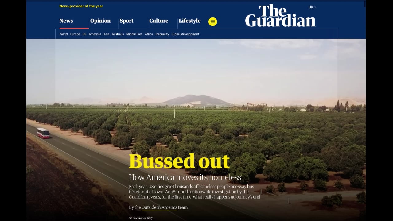
This kind of data-driven article is excellent at explaining longer topics in depth and exploring data sets that might be complex or unintuitive on their own. “Scrollytelling” is a subset of this type, where the act of scrolling down the page triggers animations — particularly effective in data-driven pieces (like this Guardian article from way back in 2017) where the data can be animated to stunning effect.
Show data over time
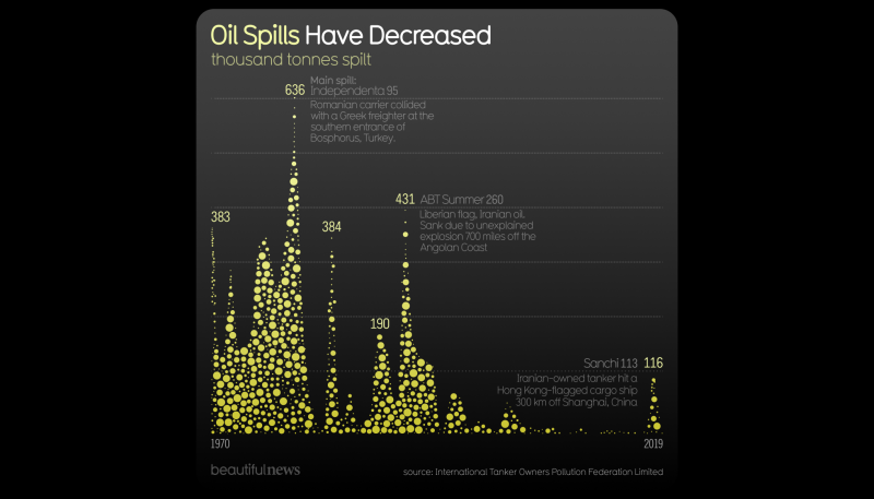
A statistic might be considered a snapshot of the world, frozen in time, and it can be hard to tell whether a given number is good news or bad. For example, if I tell you that 116,000 tonnes of oil were spilled into the oceans in 2019 it sounds terrible!
Visualising data over time allows us to understand how things change and whether a given number is going up, down, or staying the same. If you want to illustrate the difference you’ve made over the last ten years, then don’t just tell people the number of wells from this year — showing the steady progress you’ve made and talking about challenges or successes makes for a much more compelling story.
We can also visualise live data to show what’s happening right now. The UKHSA dashboard was born from the COVID dashboard, which provided information about rates and locations of infection, exposing valuable information that guided behaviour across the country. This particular dashboard is updated weekly, but in fast-moving areas like finance, a visualisation might be updated multiple times a minute.
Adapt to your audience
Your organisation almost certainly has a range of audiences, from funders to customers and journalists, who all have their own interests and aims. Funders might be interested in understanding your impact on a national scale, whereas individual donors or customers might want to see local data about their area. This range of detail can be hard to deliver in a static page or report, but an interactive data visualisation can offer multiple “ways into” the data to show people only what they want to see.
This project for the Electoral Commission does just that. It visualises data about how much candidates spent during the 2019 general election: important information in a democracy, but dry and dense. It offers users a range of options:
- “Highlight” shortcuts like Who won by spending the least? that let curious but casual users see the headline figures
- “Find a candidate” functionality to let motivated users see data about an individual candidate or region, perhaps their own MP
- An advanced search that lets power users like journalists interrogate the data by constructing queries like show me the top ten Labour candidates in Wales by advertising spend.
These options make the data accessible to a much wider range of people, and controls like sorting, filtering and searching all help people find the data that they care about.
What’s next?
This post has shown just a handful of examples from a large and rapidly growing field, but I hope you’ve seen something that sparked your curiosity. If so, the next step is to think about how you can use data visualisation to help your organisation.
Data visualisation is a blend of editorial, design and coding that’s equal parts art and science — but don’t be put off if you’re not an artist, writer or coder, because the barriers to getting started are surprisingly low. Developing a dashboard or interactive viz might involve hiring a professional, but almost every visualisation starts with a simple pencil sketch to explore layouts and concepts, and there’s nothing to stop you trying out ideas for yourself.
The easiest way is to take a number or simple data set from your organisation and think about the narrative behind it. Think about why it’s important to you, what part it plays in telling your story, and why it’s interesting. What could you do to bring it to life and help people connect to it, to engage their empathy and curiosity?
So why not have a go? We’d love to see what you come up with!
This was a guest post by Tom Evans, a former Numikon who has also worked as Technical Director with Information is Beautiful. Tom is a freelance Creative Technologist with two decades’ experience in digital. He specialises in end-to-end development for web-apps and data visualisations, but also builds prototypes, games and websites. His work has covered innovation, user-experience and development for clients like Information is Beautiful, Beyond Words, the BBC, Channel 4 and the NHS. Find out more about Tom on his website.