Should I put my content ‘above the fold’?
There’s a lot more to engaging your users than putting content ‘above the fold’. We actually think the distinction between above and below the fold is increasingly irrelevant - the important thing is to create great digital experiences.
Deciding what goes above or below the fold is a persistent conversation in web design projects. It’s usually about the homepage, which tends to be the trickiest page on the website to get cross-organisational agreement on because it’s the only page where every team overlaps.
It’s natural to assume that users are more likely to see something if it’s right there on screen as soon as the website loads, but we think this is the wrong way to approach your homepage design. User attention isn’t a finite resource for you to direct, it’s something you continually generate by serving their needs.
Whether or not content should go above the fold is highly context-dependent, and we’d encourage you to start by thinking about what your users need and what the page is trying to achieve. In this post, we’ll explain why the ‘above the fold / below the fold’ distinction isn’t as crucial as you may think and provide a better way of thinking about how to prioritise information on your website.
What is above the fold?
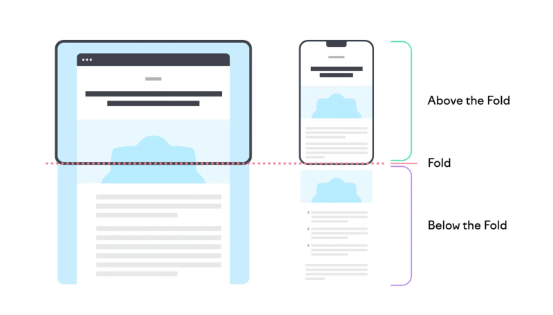
‘Above the fold’, in the context of web design, refers to the area of a website that is on a user’s screen when they first land on it. Areas below that, which they have to scroll to reach, are known as ‘below the fold’.
Image Source: SEMRUSH
The term comes from when print newspapers were folded in half. The area above the fold is the most important bit of real estate on a paper, because it needs to be attention-grabbing enough to encourage a passing customer to buy it.
But websites aren’t piled up on supermarket shelves, and homepages serve different needs than the daily news. The phrase survived the rise of digital, but the practice is totally different.
Users scroll
It may have been true in the early days of the web that slow load times kept a user’s focus on the top of a page for longer, but this is no longer the case. Users scroll, they navigate, or they bounce. A study of 20,000 sessions from a wide range of websites by Sculpt Digital found 85% of users scrolled down below the fold.
Many of the remaining 15% were checking the menu items and navigating away to a specific page. The number of people looking at everything above the fold and not scrolling was negligible.
Less is more
The area above the fold on your homepage will inform many users’ first impression of your website. It takes just 50 milliseconds for someone to form their first unconscious opinion of your website. In a split-second, users are already deciding whether they trust your organisation or not, and if they like what they see.
They’re not generating this split-second opinion by reading the content on your homepage. This first-impression is based on how the page looks, not what it says.
Pages that try to pack a lot in above the fold end up looking busy and cluttered. There are too many elements competing for a user’s attention.
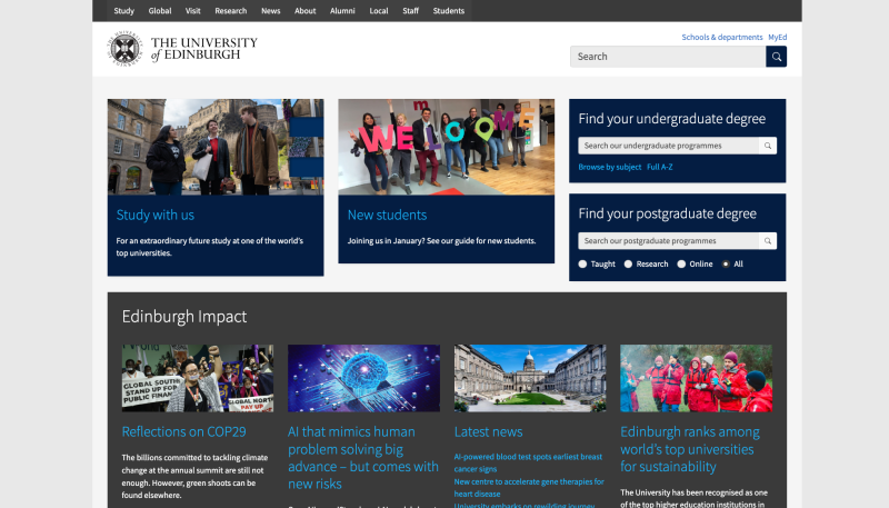
To illustrate our point, we’ve shown the University of Edinburgh’s website above, which provides users with 21 different elements they can click on above the fold. We don’t want to single out any one website, as it’s a common problem we see all the time. Edinburgh's website is not an outlier, it's actually typical of higher education websites.
On average, you can hold five to seven items in your short-term memory, which means presenting a user with more choices than that is counterproductive. Studies show users spend six seconds on average looking at a web page’s written content. Can your users get the gist of what you’re saying in six seconds? If not, they’re likely moving on clueless.
Instead of trying to present as much information above the fold as possible, you need to make decisions about your key priorities and what your users need, to distil your offering and only present a single, clear message above the fold.
Show your priorities with visual hierarchy
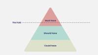
If everything’s a priority, nothing’s a priority. Great homepages require you to make trade-offs and decide on the most crucial elements that your homepage should show about your organisation.
It’s worth spending some time to map out this hierarchy for the messages you want to deliver on your homepage. The simple diagram above shows that you should reserve the space above the fold areas for absolute must have content. Who are your biggest user group and what do they need the most? Put it here. If you have more than two key messages in that ‘must have’ zone, you need to re-think the hierarchy.
Put user needs first
Organisations can get bogged down in internal battles about what content is most important and constitutes a ‘must have’. You should be focussing on your users’ needs above all else. What are users coming to your site to do? What information do they need? Check in with your user profiles, and consider their goals and tasks. The way you prioritise your content should reflect these goals.
Next steps
The most compelling websites accept that user attention is earned, not demanded. They create experiences that feel natural, intuitive, and responsive. Whether content appears above or below the fold becomes irrelevant when every element on the page serves a clear, user-centric purpose.
The question to ask is not ‘should this go above the fold?’ but rather, ‘is my website visually compelling and designed to meet the needs of users?’
If you’re looking to answer that question and drastically improve the design of your website, check out our Digital Brand and User Experience package. Our team of design and UX experts can create impactful digital experience to evolve your brand and achieve better results.