Best University Websites of 2023
With over 50% of prospective university students deciding where to study from the website alone it's crucial your university's website is well designed.
University websites need to serve several different user groups with varying needs, making them a tricky design challenge. A university website has to:
- Be an effective tool for student recruitment
- Present the university and its courses to prospective students
- Showcase the university’s research (which is crucial for demonstrating the impact for funding)
- Serve as a functional space for current students and staff
It’s a complex set of demands, but with clever design choices, university websites can impress all these users and deliver outstanding results. We’ve collated 10 examples of the best university websites to give you design inspiration for your next project.
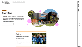
York St John University
York St John University’s website has a clean and relatively minimalist design, which allows it to stand out in a space where many higher education websites can feel crowded. It takes the somewhat unusual approach of having the main menu on the right-hand side rather than across the top.
The course finder has a refreshingly simple and clean UX, and the course pages are well thought-out, featuring videos, testimonials, in-depth detail on course structure, and punchy stats on student satisfaction to impress prospective students.
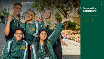
University of San Francisco
The University of San Francisco’s website strips back complexity and opts for a simple, bold design that successfully avoids the clutter that can plague university websites. The branding is clear, consistent and strong.
They use a hamburger menu, which keeps the design free from complex navigation. Once opened, the information architecture does a good job of making a large and complex website appear simple to the user. The site also does a great job at bringing in the university’s social media content in a way that is consistent with the brand, and introduces tools such as VR tours to help students envisage themselves attending the university.
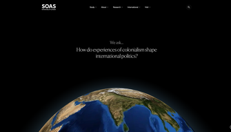
SOAS
SOAS, which is part of the University of London, specialises in the study of Asia, Africa, and the Middle East. Their website, which we designed, takes the bold approach of focusing on the questions students ask, positioning SOAS as an institution that shapes the students who will answer the big questions facing the world today.
The strong brand and interactive animations leave a great visual impression on the visitor, and the website also benefits from an excellent information architecture to allow users to easily find what they’re looking for. Although the site makes great use of animation, accessibility has not been forgotten. The site meets the WCAG 2.2 AA standard, incorporating accessibility best practices like focus indicators and being designed to be navigable via keyboard only.
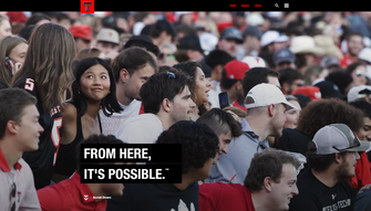
Texas Tech
Texas Tech’s website is enticing thanks to the stripped-back design that presents only a slim and simple top navigation above the fold.
The strong use of colour is bold and different, and the site leans heavily on impactful visuals and videos with relatively minimal copy for a university website. This lets it stand out from the crowd and develop a distinctive feel. Much like the University of San Francisco, the design also successfully features the university’s social content in a way that’s in keeping with the overall brand.
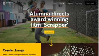
Ravensbourne University London
Ravensbourne, part of the University of London is a vocational university focused on digital media and design.
We redesigned their site, reflecting its position as a cutting-edge school of design and creativity. It is playful and inviting, making use of carefully thought-out micro interactions that help bring the design to life.
The circle motif from the university’s logo is leveraged through the designs, becoming an interactive animated feature of the website and cursor icon in certain areas, building that sense of play and creativity that the institution embodies.
The website also includes interactive elements, such as 3D tours of the campus and student accommodation, to help prospective students imagine themselves there. You can read more about how we approached the design of Ravensbourne University London in our case study.
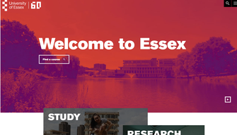
University of Essex
The University of Essex’s website is bold, bright and engaging. Scroll animation on both text and images creates a sense of energy and movement, creating a sense that the university is a dynamic place.
Branding is also a key part of the University of Essex’s website. Every part of the website is distinctly Essex, whereas some universities can feature weak brand application the deeper into the site you go.
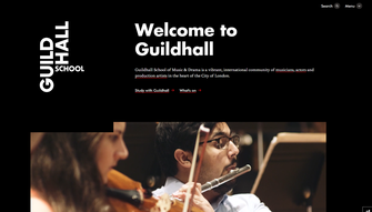
Guildhall School of Music and Drama
We redesigned the Guildhall School’s website, using movement and video to capture the dynamism of live performance.
Animations bring in the page’s content step-by-step, taking the user on a journey and giving the sense of an exciting reveal, rather like a theatre curtain opening at the start of a show.
The design is stripped back and simple, so that there’s no clutter to distract from the visual impact of the videos and images. The main menu is minimal, but when opened it does an excellent job of dividing content into the institution’s different specialisms; Drama, Music and Production Arts.
You can read more about our approach in our case study.
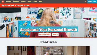
School of Visual Arts NYC
The School of Visual Arts New York City is an Art College whose website reflects the creativity that it fosters in its students.
Its highly distinctive design is playful and unusual and makes use of a maximalist colour palette. This makes the website ooze creativity, while still presenting all of the key information. The ‘Spotlight’ section really shines, showcasing students’ work in a prominent position on the homepage.
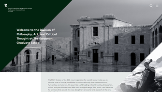
European Graduate School
The European Graduate School is a post-graduate institution that operates in Saas-Fee in Switzerland and Valletta in Malta. Their website is sleek, stylish and has an understated confidence. Its design replaces a navigation menu with a hamburger menu that lets the other assets on the page make a strong visual impact. When opened, the menu takes over the entire page.
Simple but effective micro-interactions, such as the bars of the hamburger menu becoming an X, help give the site a premium feel.
The design makes the faculty front and centre of the proposition, which compliments their world-renowned staff and successfully cultivates a sense of prestige.
University of the Arts London
The University of the Arts London uses a simple and striking white-on-black design that lets imagery take centre stage. Using images at every touchpoint of the site reflects the university’s ethos of championing art and design.
Evolving your university website
Few higher education websites truly stand out. Many are formulaic and often overly complex, with lots of different types of content vying for attention. These 10 university websites show that this doesn’t have to be the case. Developing a clear vision and thinking about how to apply your brand digitally can help you to create a website that impresses visitors. However, university websites must not only look great, they also need well-researched information architectures to make them intuitive. If you’re looking for help designing a university website that looks fantastic while also serving user’s needs, we’d love to talk. Get in touch via [email protected].