We've collated twelve of the most interesting, creative, and effective museum and gallery websites.
- Attracting visitors and selling tickets
- Promoting exhibitions
- Informing visitors
- Generating revenue (through donations, memberships, ticket sales or e-commerce)
- Hosting digital collections
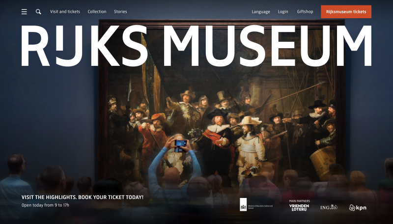
Rijksmuseum
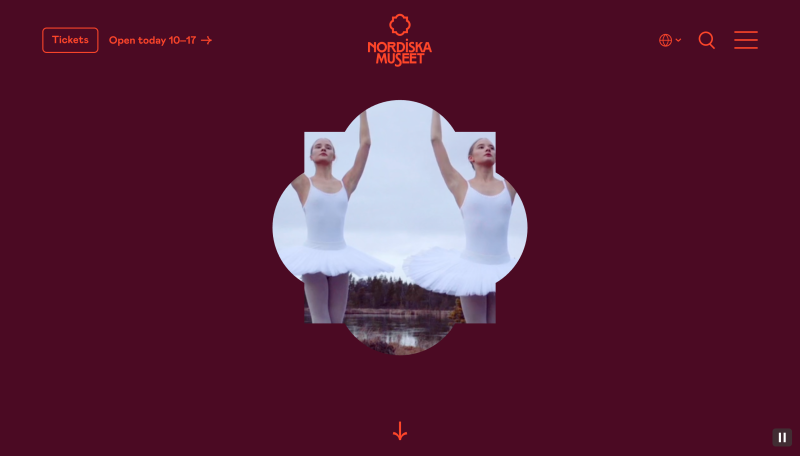
Nordiska Museet
Sweden’s largest museum of cultural history, the Nordiska Museet, tells the story of life and people across the Nordic region and boasts a collection of over 1.5 million objects. Its award-winning website, recognised with a 2025 Webby, a Lovie Award, two Swedish Design Awards, and a Muse Award, brings this heritage to life through interactive, design-led storytelling.
An emblem from the museum’s original seal serves as the homepage’s dynamic framing device. As users scroll, the webpage zooms into a high-quality embedded video, drawing focus to the featured content and encouraging further scrolling.
Across the site, interactive components are used to highlight the museum’s exhibitions and content, with subtle text animations that respond directly to the user’s scroll.
Colour is used with confidence, drawing from the museum’s interior and exterior. Each exhibition is given its own adapted palette, therefore helping the content to feel easily distinguishable without fragmenting the website’s overall look. The result is a strong, cohesive user experience that feels inviting and easy to navigate.
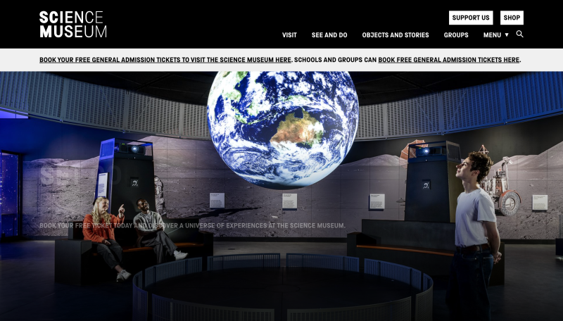
The Science Museum
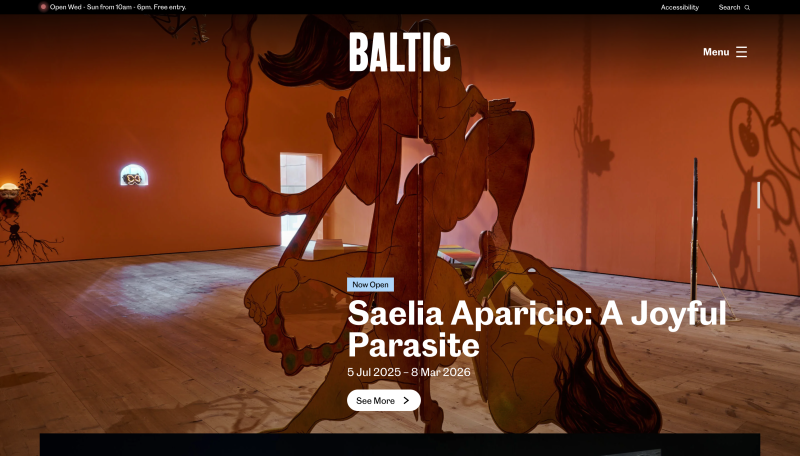
Baltic
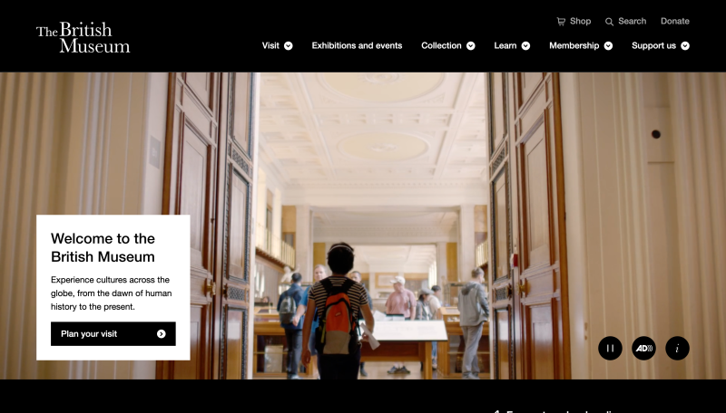
British Museum
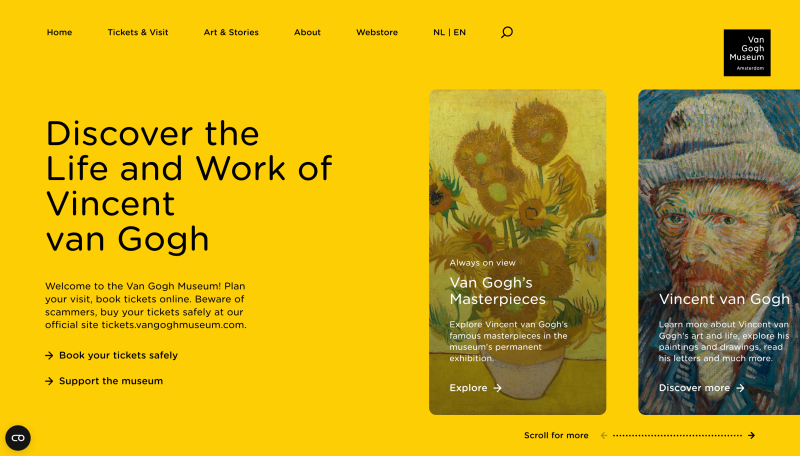
Van Gogh Museum
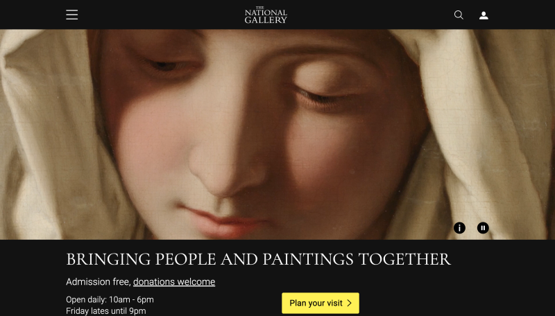
The National Gallery
The National Gallery in London is home to over 2,600 paintings. Its website design is deliberately understated, with a calm authoritative presence that reflects the prestige of the collection.
Rather than bombarding users with visual noise, a discreet hamburger menu in the top-left keeps the homepage uncluttered, allowing the hero imagery and key information above the fold to take centre stage.
Well-structured navigation means that the website is well-equipped to support a range of user needs, from straightforward tasks like planning a visit or finding an exhibition, to more exploratory browsing across artists and individual works. Together, these design choices allow for open-ended discovery without friction.
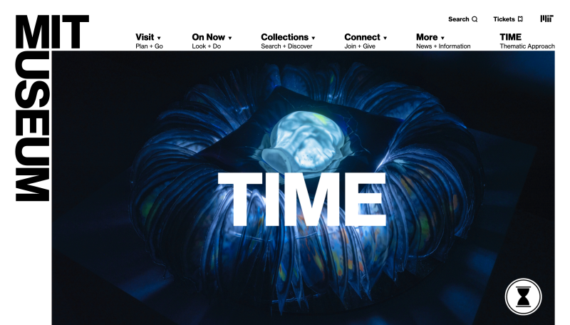
MIT Museum
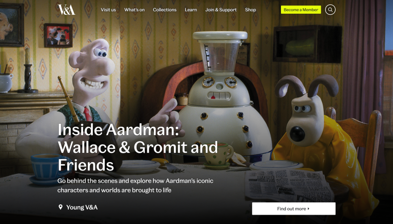
The V&A Museum
The Victoria and Albert (V&A) encompasses a family of museums with a collection spanning 5,000 years of creativity.
The website makes discovery effortless, with a prominent search bar and well-organised navigation that guides users through exhibitions, collections and events.
A standout feature is their digital collection, home to over 1.25 million objects. The ‘Explore the Collections’ page pairs detailed imagery with clear contextual cues such as ‘on display’ indicators and gallery location tags. Behind the scenes, an object-centric CMS links individual objects to exhibitions, events and multimedia content. The result? A seamless, interconnected user experience.
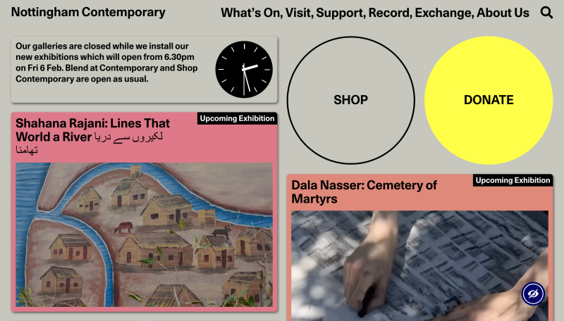
Nottingham Contemporary
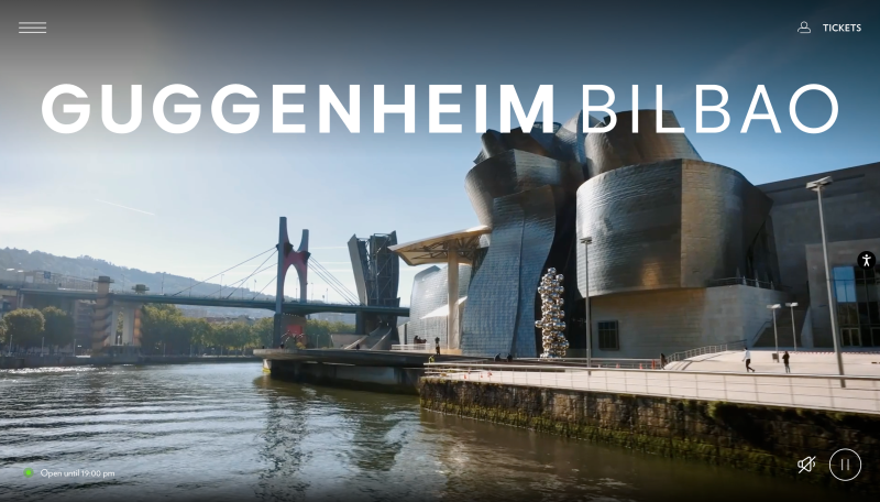
Guggenheim Bilbao
Cooper Hewitt