Best Museum & Gallery Websites of 2024
We've collated ten of the most interesting, creative, and effective museum and gallery websites.
Museums and galleries are driven by their missions to bring culture to the public. Their websites play a crucial role in this mission by:
- Attracting visitors and selling tickets
- Promoting exhibitions
- Informing visitors
- Generating revenue (through donations, memberships, ticket sales or e-commerce)
- Hosting digital collections
A good museum or gallery website gives visitors all the information they need to inform their visit, laid out in a clear way that’s easy to navigate. A great museum or gallery website does the same, but in a way that creates a sense of excitement and wonder, taking users on a serendipitous journey of discovery through digital collections. Some of these websites even become a destination themselves. We’ve rounded up 11 of the most creative and effective museum and gallery websites to inspire your next GLAM sector website project.
Rijksmuseum
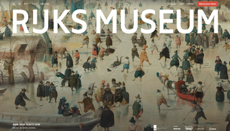
The Rijksmuseum is the national museum of the Netherlands, telling the story of Dutch history through its art. Their website puts the art front and centre, with a simple yet striking design. The ‘Stories’ section brings the art to life with engaging videos exploring different objects. There’s substance as well as style, with a simple information architecture and frictionless ticket purchase journey.
Baltic
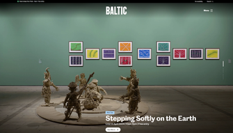
The Baltic Centre for Contemporary Art, known simply as Baltic, is a gallery in Gateshead, UK. The website’s design does a great job of capturing its bold, modern, and uncompromising artistic vision. A striking, typographically-driven animation as the page loads gives way to a highly visual design that takes visitors through the current exhibitions using animations on scroll.
Baltic’s website makes life easy for its users by keeping key visitor information in a prominent location in the top left across the whole site, alongside a green/red status indicator to show if the museum is currently open or closed. These open/closed status indicators are becoming more common on museum websites as a quick visual way to answer one of the users' most frequent questions.
Van Gogh Museum
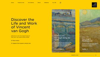
The Van Gogh Museum in Amsterdam has a simple yet effective design that takes the unusual step of scrolling sideways, rather than vertically, on the homepage. Scrolling also changes the colour palette, an initially subtle yet captivating effect that invites continued exploration.
The information architecture uses a well-designed dropdown menu that matches the colour of the page and is pleasingly animated to enhance the user experience. The Digital Collection is also well designed, with a user-friendly search interface that surfaces the collection's paintings to the user, rather than showing nothing until they input a query.
The Science Museum
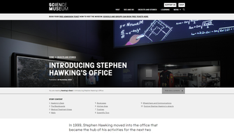
The Science Museum is part of the Science Museum Group, which consists of the Science Museum in London, the Science + Media Museum in Bradford, the Science & Industry Museum in Manchester, as well as the Railway Museum in York and Locomotion near Darlington. The Science Museum is among the world's most visited museums, and the website is especially good at showcasing the museum's digital collection in its ‘Objects and Stories’ section. Here, users can explore the collection by topic, see featured historically significant objects, and delve into curated stories, such as the story of Charles Babbage’s Difference Engine.
Admittedly, we’re marking our own homework as Numiko designed and built the website. But, it’s not just us who think it’s among the best museum websites; it also won an international GLAMi award in Vancouver and a Webby Award in 2023 for its interactive children’s section Wonderlab+. You can read more about how we approached the design of the Science Museum Group’s websites here.
MIT Museum
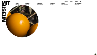
The MIT Museum showcases technology-related artworks at the Massachusetts Institute of Technology. As you’d expect from a museum dedicated to tech, its website doesn’t disappoint. The design deliberately presents images behind blocks of colour, with geometric shapes forming ‘peepholes’ that reveal part of the image behind. This creates a sense of curiosity and teases the user to want to discover more.
In the ‘Collections’ section users can add objects to their own collection and share it with a personalised link, all without any need to log in. The lack of any sign-up barrier means this is easy to use spontaneously, so curious users can start collating their collection straight away.
Nottingham Contemporary
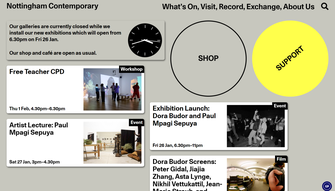
The Nottingham Contemporary is a modern art gallery in Nottingham, UK. Their website stands out by being deliberately retro, cultivating a kind of brutalist aesthetic which is highly unusual but complements their experimental artwork. Microinteractions like the rotating support button on hover lend a sense of fun and whimsy.
This is a website that doesn’t take itself too seriously, but successfully delights its users. The use of an analogue clock in a digital medium is another subtly unconventional touch, as is reversing the wording of the home button on hover. This is a website that subverts the usual rules of web design. After all, rules are made to be broken.
British Museum
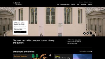
The British Museum in London is one of the most visited museums in the world, and its vast digital collection means there’s a huge amount for website visitors to explore. To successfully serve this huge, diverse audience, the website focuses on clarity and usability. The top nav bar makes the large and complex digital estate appear simple and easy to navigate.
The design helps exhibitions stand out by curating their appearance. Exhibition pages are assigned their own colour, which often comes from an element of the exhibition. This is used across the page and appears on hover when the exhibition is featured elsewhere on the website, giving each exhibition its own unique feel.
The museum’s impressive digital collection is curated into engaging themes and topics, allowing users to explore different objects through story pages, 3D models, and wider cultural or historical context. This is another website created by us, so can find out how we designed and delivered The British Museum’s website in our case study.
Nobel Peace Center
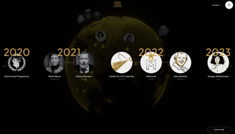
The Nobel Peace Center in Norway has a clean website with a simple yet highly effective design. The colour palette is typically Scandi and the overall feel is understated simplicity; less is more. Small touches add to the UX, such as the way the top nav bar fades out when scrolling down - as your attention is on the new content being revealed - but fades back in when you’re scrolling back up.
The interactive timeline of Nobel Peace Prize Laureates is highly immersive and draws the reader in to explore a dynamic space that they can manipulate.
Guggenheim Bilbao
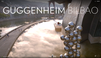
Known for its iconic architecture, the Guggenheim Bilbao is a contemporary art gallery in Spain’s Basque Country. Like its building, Guggenheim Bilbao’s website is instantly captivating. A full-screen hero video takes over the above-the-fold area of the homepage, showcasing the exhibits and the building itself.
The simple, tile-based design lets the impressive art take centre stage, while a gentle zoom on hover adds movement to create a dynamic feel. Like Baltic, the website includes a small simple green circle to indicate that it’s open and to inform the user of the closing time.
Embracing its reputation as one of the world’s most photographed buildings, the website collates user-generated photos in its #MyGuggenheimBilbao section, creating a social and interactive feel.
The website won a 2023 Webby Award, which is a testament to its excellent design.
Cooper Hewitt
Cooper Hewitt is the Smithsonian’s design museum in New York. It hosts one of the most diverse and comprehensive design collections in the world – more than 215,000 objects spanning three millennia.
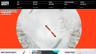
As you’d expect from a museum dedicated to design, its website has been carefully crafted to be both visually appealing and easy to use. The information architecture is clear and effective. The site uses a slightly unusual top nav design that opens sub-menus on click, using a pink accent colour to focus the user’s attention on the newly revealed sub-menu options.
One of the site's standout features is its impressive digital collection. This is well presented and curated, with collection highlights, featured objects, and collections in motion sections providing great ways to get started with exploring the huge range of objects. Users can add objects to their ‘Shoebox’, a personalised area where users can view objects they saved, which they can do both within the museum itself and on the website when viewing the digital collection. This interactivity lets users get involved in curating their own collections, helping them to form deeper connections with the museum’s objects and their stories.
Visit the Cooper Hewitt- Smithsonian Design Museum’s website
Creating a great museum or gallery website
Every museum or gallery is unique, but often their websites fail to stand out from the crowd. These 10 websites show that it’s possible to capture the essence of your institution and create something truly unique, without compromising on usability. We’ve deliberately collated a list of highly creative museum websites that have tried something different, so you can be inspired by the different ways they’ve addressed similar challenges. If you’re thinking about how you can improve your museum website, we’d love to talk. Get in touch to have a chat about your project.
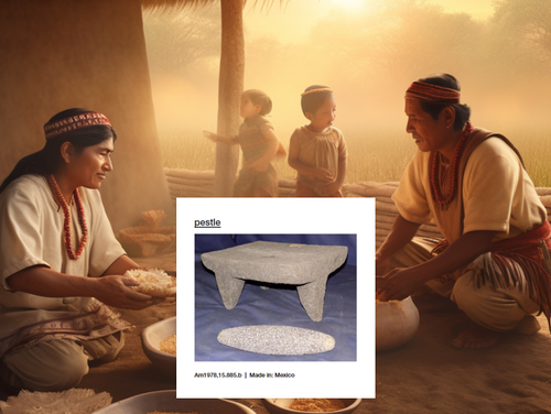
AI can be a powerful tool for museums, both for curation and to bring objects to life. We wanted to share our ideas for how museums can use this new technology to delight visitors and enhance their experience.