Most think tank websites struggle to make the huge amount of content they publish easily navigable for users. We’ve uncovered the ones that solve this problem.
Intro
- provide a clear structure to their content
- make their research easy to find
- successfully engage users to make them more likely to get involved with or become an advocate for their work.
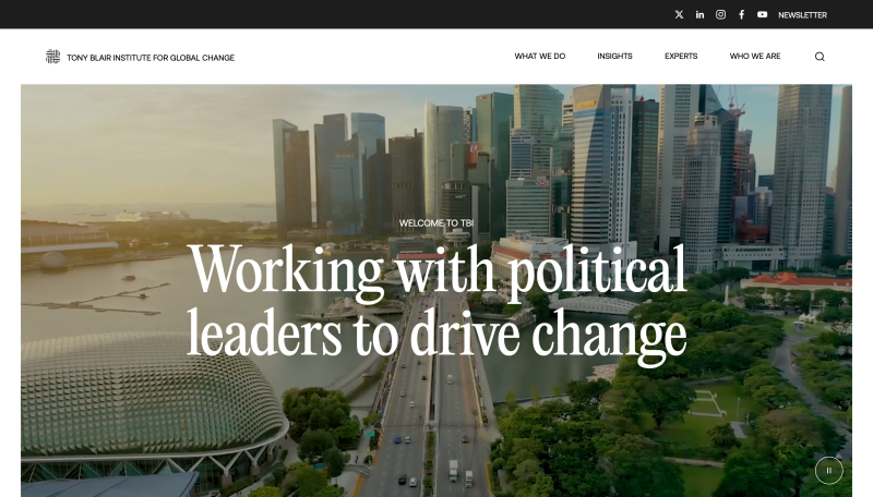
Tony Blair institute for global change
The Tony Blair Institute for Global Change has a website that stands out in the sector for the level of care taken to the design and motion language.
Subtle animations on scroll and hover-states for teaser cards create a dynamic website that feels fun to explore. Visually, this is one of very few think tanks using photography in an interesting way, thanks to a well-thought-out photographic style that uses warmth and light to convey a sense of optimism that aligns with the site’s broader message.
The homepage also leads with a clear exposition of the institute’s mission: ‘here to turn bold ideas into reality. We help governments and leaders get things done’. This plain and simple language makes it easy for users to understand what the organisation does, which informs their subsequent usage of the site.
Explore the Tony Blair Instutite for Global Change's website for yourself.
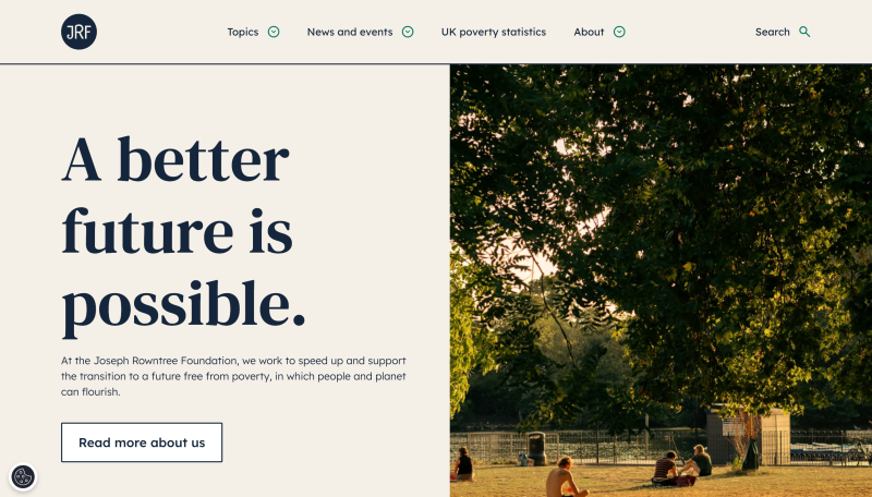
Joseph Rowntree Foundation
The Joseph Rowntree Foundation is the UK’s leading poverty advocacy think tank. We’re proud to work with them to deliver their website, so while we might be a bit biased, we genuinely believe this site stands out as a fantastic think tank website.
The Joseph Rowntree Foundation's website is notable for its pared-back simplicity and effective information architecture. Despite hosting a vast amount of research, the site's IA makes it appear deceptively simple. Just three items appear in the top navigation to avoid overwhelming visitors. Their research is organised into topics that align with what their users are looking for, rather than reflecting the organisation's internal structure.
These topic pages act as hubs, providing some useful context and the latest research in that area. Visually, the site's clean, clear design and soft colour palette give it a calming feel, that’s well-suited to what can often be challenging subject matter.
It’s also designed with accessibility in mind, and was assessed as being the most accessible charity website in the UK by the SilkTide index.
Read more about the Joseph Rowntree Foundation’s website in our case study or explore their website for yourself.
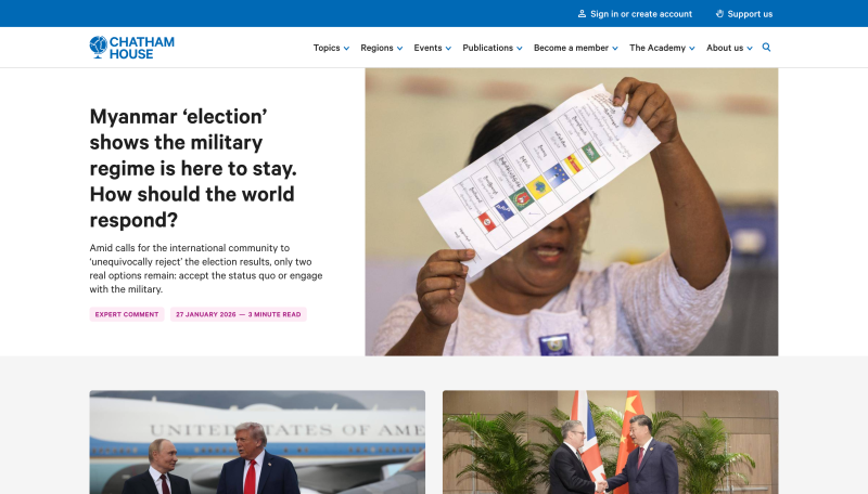
Chatham House
Chatham House is a leading international affairs think tank, also known by its official name, the Royal Institute of International Affairs.
This is another think tank website designed & built by our team, but we believe it deserves mentioning on its own merits.
Chatham House has tens of thousands of pages of content, so its information architecture (IA) needs to make this large & complex site easy to navigate. Again, the key is the grouping of information by topics, which reflects the needs of users. The site also uses stats to convey its impact alongside its mission statement, using a counting effect to grab your attention.
You can read more about how we approached the design of Chatham House in our case study or explore their website for yourself.
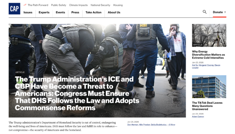
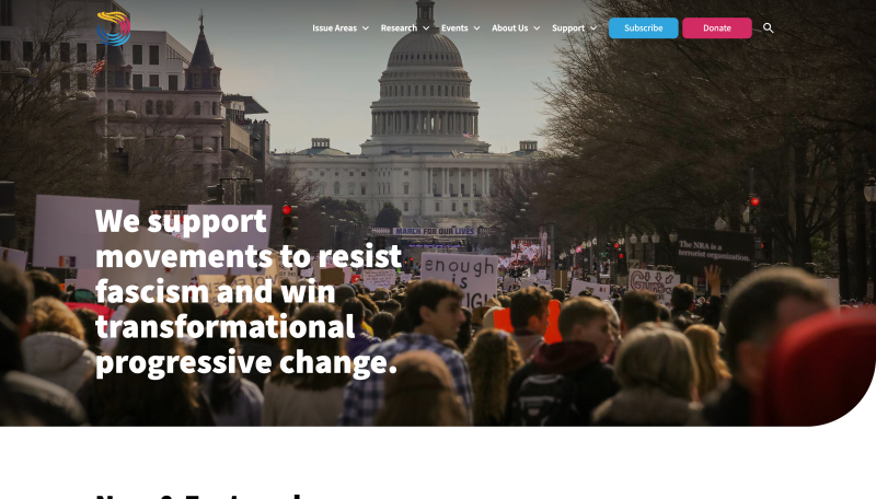
Center for American Progress (CAP)
The Centre for American Progress is a progressive, independent think tank that seeks to improve the lives of Americans with bold ideas and leadership. Its website is simple and confident. The bold typography, sharp corners and restrained colour pallet create a serious feel, which is ideal for a website dealing with important topics.
Most importantly of all, the information architecture is highly effective. It groups content based on the user's needs, dividing information into distinct sections. Opening the ‘Issues’ section reveals a full list of topics, but also highlights their five key priority areas using thumbnails to showcase these hub pages.
The hub pages gather key information on each topic in one place, presenting a summary of the issue, key stats, and profiles on the relevant experts. It also provides links to next steps so users can take action. These pages help users understand an issue more deeply before going onto read specific articles relating to it.
Explore CAP's website for yourself.
Institute for policy studies
The Institute for Policy Studies (IPS) is a US think tank dedicated to building a more equitable society.
Their site is clean and clear, and doesn’t try to present too much information at once.
Above the fold on the homepage, the site restricts itself to a single sentence to convey its mission, with no snippets, buttons or other teasers competing for attention.
The information architecture arranges the key content by ‘issue areas’, which organise their work and reports on that topic.
Explore IPS' website for yourself.
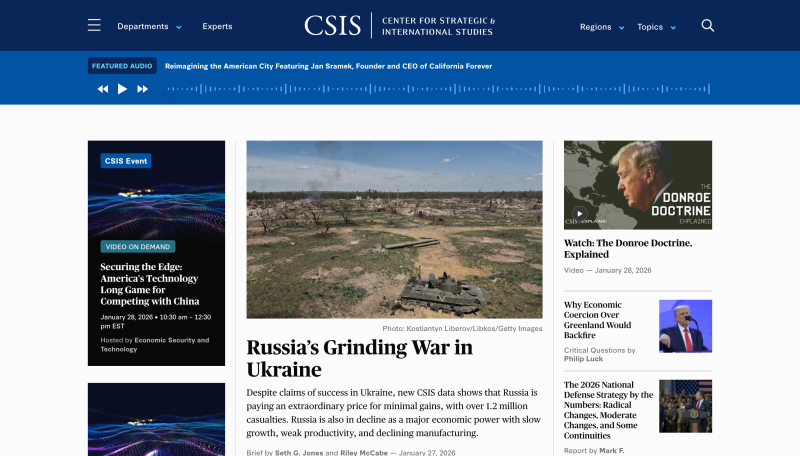
Centre for Strategic and International Studies (CSIS)
The Centre for Strategic and International Studies (CSIS) is a nonprofit policy research organisation dedicated to defining the future of national security. Its website stands out for its strong editorial clarity and multimedia integration, positioning CSIS as a news-led, agenda-setting platform rather than a traditional research repository.
From the moment users land on the homepage, CSIS signals its editorial ambition; top stories are prioritised and a featured audio banner highlights podcast content. Vertical video is interspersed with longer formats, providing variety, while long-form content is broken into digestible chunks that allow readers to learn through videos, quizzes, infographics, and interactive imagery. This layered approach allows users to explore content at their own pace.
One slight drawback is an extensive burger menu, which is arguably overpopulated and makes navigation less intuitive.
Explore CSIS' website for yourself.
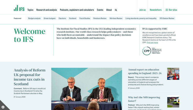
Institute for Fiscal Studies (IFS)
The Institute for Fiscal Studies adopts a minimal design that reflects its role as an independent economic research institute, allowing its research to take centre stage and speak for itself.
The homepage is well structured, using a banner to highlight featured content and help users quickly orient themselves around topics most suitable to them. A particularly notable feature is impact statistics that animate into view as users scroll, drawing a user's attention to this key information.
The site also brings economic policy to life through a series of interactive tools and calculators that let users explore where they lie in the UK income distribution. They can test how different tax and spending choices shape public finances and social outcomes, making the website an intuitive, hands-on way to understand complex economic issues.
Explore IFS' website for yourself.
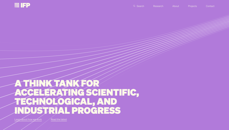
Institute for Progress (IFP)
The institute for progress is an American based think tank focused on accelerating scientific, technological and industrial progress.
Its website uses design to establish a clear identity and set the tone from the moment users land on the homepage.
A bright and varied colour palette runs through the site, giving the content personality, while research is organised into clearly defined, colour-coordinated sections that makes navigating a large body of research easy. Sketch-like thumbnail illustrations add a playful touch, helping dense content feel approachable and visually inviting.
Interaction is used thoughtfully to guide the user experience. A secondary scroll on the right-hand side highlights ‘spotlight research’, providing users with a sense of direction through dense content.
Explore IFP's website for yourself.
