With over 50% of prospective university students deciding where to study from the website alone, it's crucial your university's website is well designed.
University websites need to serve several different user groups with varying needs, making them a tricky design challenge. A university website has to:
- Be an effective tool for student recruitment
- Present the university and its courses to prospective students
- Showcase the university’s research (which is crucial for demonstrating the impact for funding)
- Serve as a functional space for current students and staff
It’s a complex set of demands, but with clever design choices, university websites can impress all these users and deliver outstanding results. We’ve collated 9 examples of the best university websites to give you design inspiration for your next project.
University of Hull
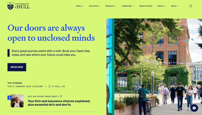
Explore the University of Hull's website for yourself.
SOAS
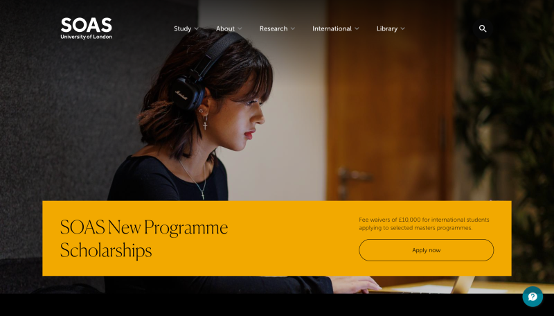
Explore SOAS's website for yourself.
Imperial College London
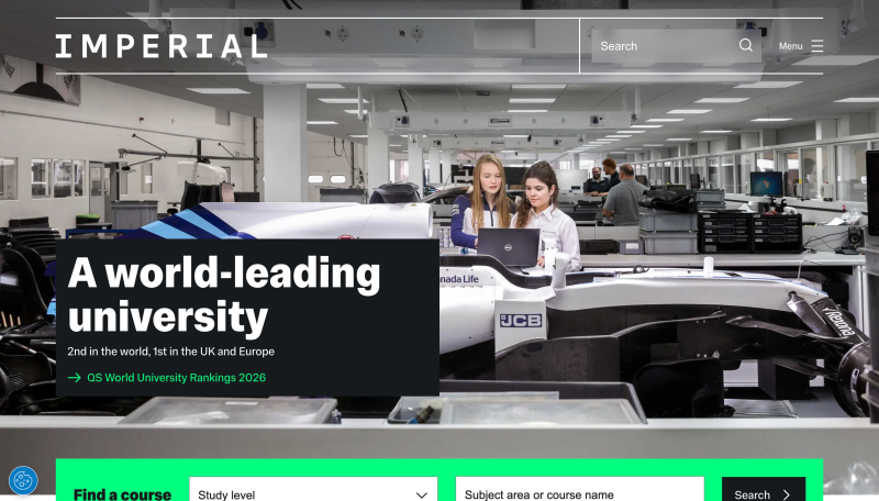
Imperial College London takes a bold approach to its homepage using a background hero image and hamburger menu to keep the focus largely on the university’s brand and world-leading status.
The site uses colour strategically to guide user behaviour. A bold, unusual green highlights the ‘find a course’ section, which peeks just above the fold, a deliberate design choice that draws the eye and encourages users to scroll deeper into the site.
Behind the hamburger menu lies a strong information architecture, designed for efficiency. For instance, the ‘study’ section features a comprehensive dropdown that covers everything from course search to executive education, making it easy for prospective students to navigate their options without feeling overwhelmed.
The result is a streamlined design that projects confidence while maintaining practical usability for diverse user needs.
Explore Imperial College London's website for yourself.
Rhode Island School of Design
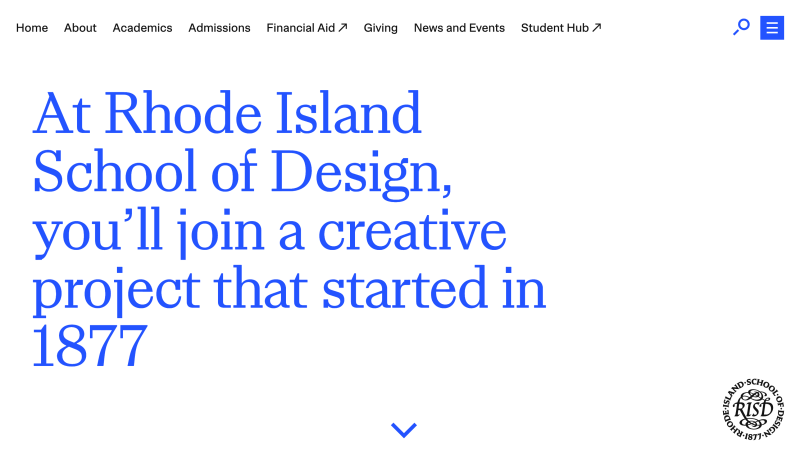
Rhode Island School of Design’s website opens with a bold statement above the fold, immediately establishing the institution’s legacy. As users scroll, high-quality images fade into view, creating an immersive experience that showcases student and alumni work.
The site’s clean, minimalist design creates a gallery-like experience, with generous white space and understated typography that ensures the focus stays on the creative work itself.
A hamburger menu provides comprehensive top navigation, displaying clear pathways for different audiences from prospective students to postgraduate students.
Explore RISD's website for yourself.
Guildhall School of Music and Drama
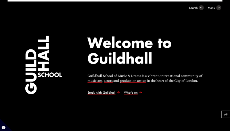
We redesigned the Guildhall School's website, using movement and video to capture the dynamism of live performance.
Animations bring in the page's content step-by-step, taking the user on a journey and giving the sense of an exciting reveal, rather like a theatre curtain opening at the start of a show.
The design ins stripped back and simple, so that there's no clutter to distract from the visual impact of the videos and images. The main menu is minimal, but, when opened, it does an excellent job of dividing content into the institution's different specialisms; Drama, Music and Production Arts.
You can read more about our approach in our case study.
Explore Guildhall's website for yourself.
Virginia Commonwealth University School of the Arts
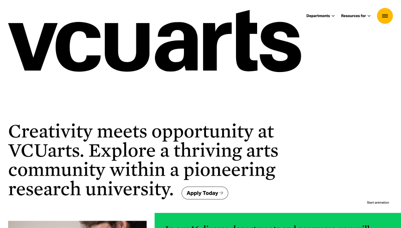
VCU School of the Arts’ website is a 2025 Webby Award winner, and for good reason. It uses colour in an unexpected way to create a distinctive visual identity. As users scroll, a vertical slice on the right side of the page gradually shifts through a spectrum of colours. The university’s logo adds another playful touch, as it transforms from black to orange, and red on hover.
On the left, a vertical carousel displays recent news and events, keeping the homepage dynamic without overwhelming visitors. Below the fold, the site showcases departments and programmes through an engaging hover interaction: as users move over each department, a relevant course image appears to give a visual sense of what each programme offers.
A hamburger menu enables straightforward navigation for users, balancing the site’s creativity with functional usability.
Explore VCU School of the Arts' website for yourself.
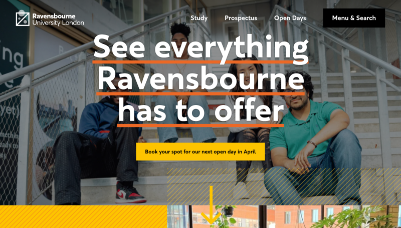
Ravensbourne University London
Ravensbourne, part of the University of London is a vocational university focused on digital media and design.
We redesigned their site, reflecting its position as a cutting-edge school of design and creativity. It is playful and inviting, making use of carefully thought-out micro interactions that help bring the design to life.
The circle motif from the university's logo is leveraged through the designs, becoming an interactive animated feature of the website and cursor icon in certain areas, building that sense of play and creativity that the institution embodies.
The website also includes interactive elements, such as 3D tours of the campus and student accommodation to help prospective students imagine themselves there.
You can read more about how we approached the design of Ravensbourne University London in our case study.
Explore Ravensbourne's website for yourself.
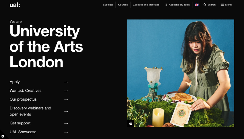
University of the Arts London
Explore University of the arts London’s website for yourself.
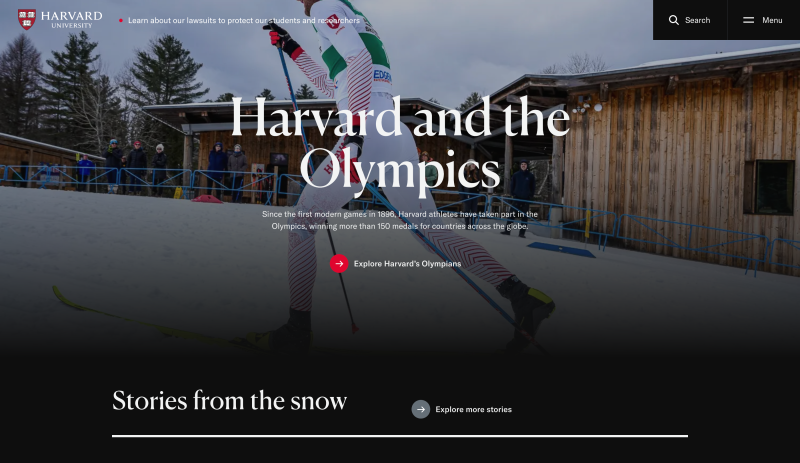
Harvard University