Your websites can look and sound different, but they should all work in a consistent way.
What is a digital estate?
A digital estate is the collection of websites and other digital touchpoints an organisation manages under its brand. Think of Oxford University with hundreds of sites for colleges, museums and departments. Or charities running separate microsites for campaigns.
Why multiple sites? Each can target specific audiences with tailored content. A research institute needs a different tone than student recruitment. A campaign microsite might need its own look to stand out. Maintaining separate websites isn’t always the right approach, it’s contingent on your organisation’s unique context. To explore this in more detail, read our article on when to unify your digital estate or maintain separate websites.
If you are going to maintain separate websites, it’s important to cultivate a degree of consistency between them, so users understand that they’re moving through a single organisation’s ecosystem. To achieve this, you need to strike the right balance. You want separate sites to be visually distinctive to appeal to their specific audiences, but also consistent enough that users ‘get’ that this site is part of your broader organisation.
Think of it like a fashion collection. A designer uses signature elements across different pieces—a shirt, coat and dress look unique but clearly belong together. Your websites should work the same way: distinct but connected.
Why consistency across sites matters
Why consistency across sites matters
Brand Recognition and Trust
A degree of consistency across all sites reinforces your identity. When sites look wildly different, users question if they're still dealing with the same organisation.
User Familiarity and Ease of Use
When navigation elements work in the same way across sites, users don't have to relearn everything. Consistent layouts and terminology reduce mental effort and frustration.
Seamless Cross-Site Journeys
Users often move between your sites. If they share common elements—similar headers, unified logins, consistent layouts—the journey feels smooth rather than disjointed. Users understand they're exploring different sections of the same organisation.
Example: The Science Museum Group
The Science Museum Group shows how to create a consistent look and feel across a single digital estate. They operate five national museums that previously had separate identities. In 2017, they unified them under one visual language.
Now every Science Museum Group site uses the same typography, layout and visual tone. Whether you visit the Science Museum or Railway Museum site, you instantly know they're siblings. The header, menu structure and layout carry over, reducing friction as users hop between sites.
As part of our work with them, we created a design system documenting all shared elements—from typography to buttons and forms. By using this, any new site automatically looks and feels part of the family.
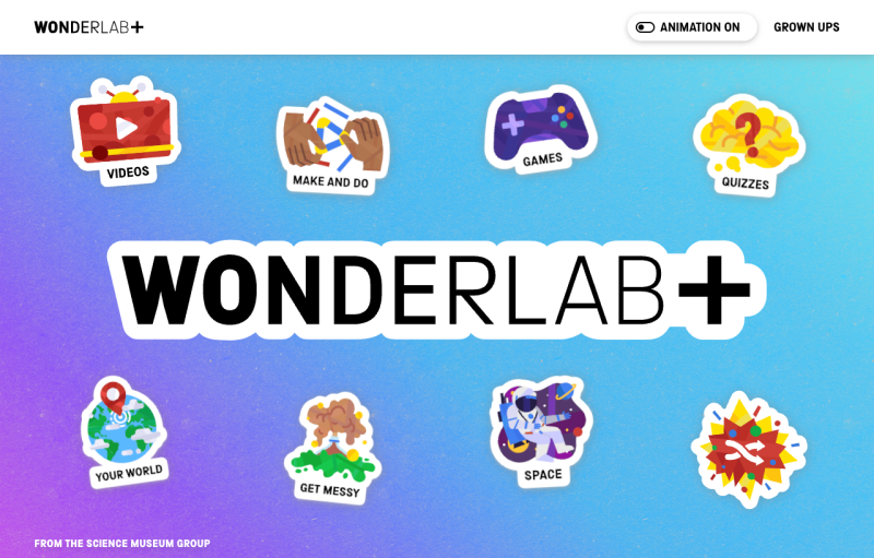
The Science Museum Group balances consistency with appropriate variation when the need arises. Their Wonderlab+ platform targets children and families. It uses core Science Museum Group design components but adds playful twists—livelier colours, bolder graphics, kid-friendly illustrations. We knew that because the audience overlap was so minimal we could push the boat out with a more distinctive design to suit the audiences’ needs in this instance.
Differentiate with colour
The Eden Project manages its main site and Eden Sessions (their sub-brand for concerts) as connected but distinct properties. Both use Eden's signature curved linework inspired by organic shapes.
Where they differ is atmosphere. Eden Sessions uses a dark purple palette to reflect nighttime concerts—a dramatic shift from Eden's usual greens and blues. It's clearly a sub-brand with its own personality, yet unmistakably part of Eden.
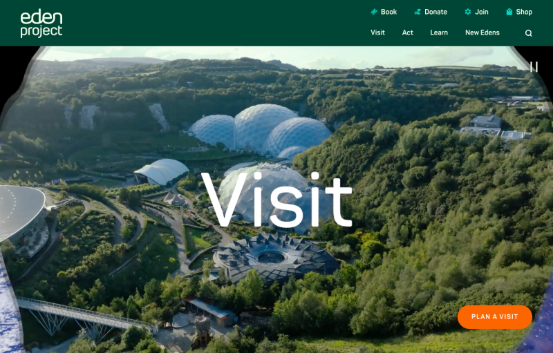
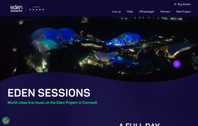
Visitors moving between sites notice the consistent graphics and design style, even as the mood shifts to suit those booking concert tickets.
Consistent foundations
When creating distinct sub-brands, you don’t want to diverge so far that users can’t see how your site relates to your wider organisation. UX elements and layouts should be kept consistent to maintain that coherence.
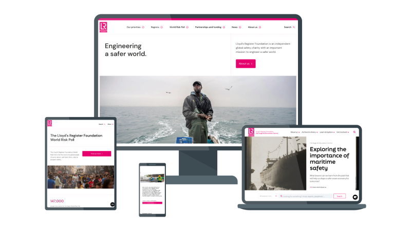
Our work with Lloyd's Register Foundation (LRF) brought a sense of unity across their multiple digital properties—their main site, Heritage Centre, World Risk Poll and others—without losing each site's distinct purpose.
Each section uses different accent colours and styling to present a distinct look and feel, yet all follow the master style guide. Same typography, same layouts, same connecting motifs. By unifying on one CMS and design framework, they improved both user experience and operational efficiency.
Balancing uniformity with flexibility
Creating a consistent digital estate has its trade-offs. Having different websites allows for distinct sub-brands, and they should have enough flexibility to let them stand out. But you want users to understand these sites are all part of a coherent whole, so don’t devolve every design decision to these sub-brands.
Striking the right balance means keeping certain features consistent, whilst allowing variation in others. Here’s how to get it right:
Keep UX patterns consistent: Navigation menus, search functionality, forms and buttons should work the same everywhere. This reduces the cognitive load on the user, because everything works as they expect it to.
Allow visual variation: Colours, photography and imagery can vary more freely. They set mood without impeding recognition. As shown previously, Eden Sessions uses darker colours to set a different tone than their main website.
Consider your audience: The more distinct your audiences, the more variation you can introduce. A kids' site can use playful illustrations or vibrant colours that wouldn't suit your main site. Just ensure you're still using the same underlying design system.
Never compromise accessibility: Every variation must meet accessibility standards. Different colour schemes still need proper contrast. All sites should follow best practices for alt text, keyboard navigation and readability.
How to keep your digital estate consistent
How to keep your digital estate consistent
Establish a shared design system
Create a design system all sites use. Include reusable components, colour palettes, fonts, and icons. This ensures new features stay on-brand and speeds development. Building new sections becomes about choosing components from the system, rather than reinventing from scratch.
Use one CMS for all sites
A centralised platform helps maintain consistency while letting each site host specific content. For example, Lloyd's Register Foundation's single Drupal platform gives editors one interface for their whole estate. This lets you operationalise your design system by creating a library of slices, which may use different colours but maintain the same UX language.
Standardise navigation and terminology
Decide on a common information architecture. Sites don't need identical menus, but they should feel related. Use consistent labelling—if one site says "Get Help", don't call it "Customer Care" on another.
Implement consistent CTAs and forms
Buttons, forms and interactive elements should behave identically everywhere. Consistent micro-interactions—hover effects, loading spinners, transitions—create polish and predictability.
Develop a theming system for flexibility
Build approved variations into your design system. Create colour themes or style "skins" that can be applied without breaking core layouts.
Develop clear brand guidelines (and training)
Document not just how but why you make design choices. Cover logo usage, tone of voice, image styles and accessibility requirements. Train teams so everyone understands and values consistency standards.
Audit for drift
Inconsistencies creep in over time. Perform periodic design audits to catch and correct deviations before they spread.
Conclusion
Creating a consistent digital estate means unifying without uniformity. When done right, it means your websites function like a well-coordinated team—each with its own role, but clearly part of something bigger.
It can be a balancing act, but striking the right balance pays off. It allows you to build brand equity, enhance user satisfaction and streamline operations by having a single design library rather than having to reinvent from scratch each time. Users enjoy intuitive journeys across all your touchpoints. Consistent components also mean tests that are shown to improve the performance of one component, like a CTA button, can easily be rolled out across your whole estate, compounding the effect for stronger results.
Our team of designers and UX experts are specialised in tackling this exact challenge. Their experience designing consistent digital estates for organisations like the Science Museum Group, The Eden Project, University of London, and Lloyd’s Register Foundation means they are familiar with the challenges these projects face and know how to solve them. Get in touch to tell us about your project.
