We round up some of the most effective and stunning designs for charity websites
A great purpose lies at the core of all great non-profits. But without a great way of communicating that purpose, you’ll be left unable to make the impact you seek as an organisation.
Non-profits and charities are hugely diverse, but their website always plays a key role in their success. It’s often the biggest way to get donations, deliver their mission, or in many cases, do both at once.
This means that clarity is key. Being able to provide a website that’s both visually captivating and easy to navigate is what makes the very best non-profit and charity websites stand out from the crowd.
Features of the best non-profit websites
- Excellent user experience, underpinned by a well-thought-out information architecture.
- Effective storytelling that creates an emotional connection.
- Strong brand identity, combined with creativity in its use.
- Clarity on the key calls to action, and simple journeys to act on them.
- Visually compelling and distinctive design.
- Accessible and inclusive of a range of users.
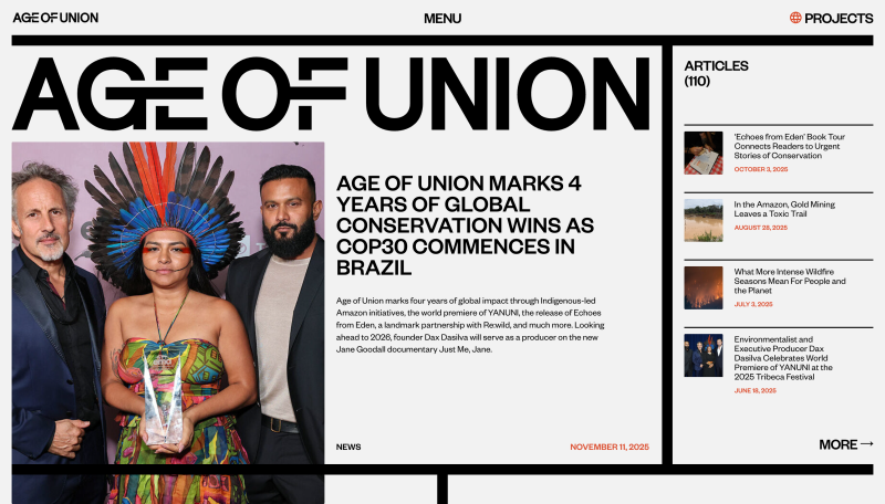
Age of Union
The Children’s Society
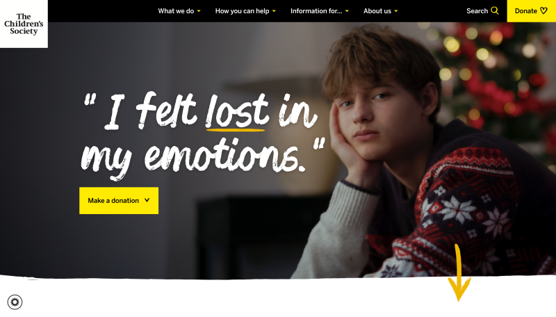
Visit The Children’s Society’s website, or read our case study.
Farm Africa
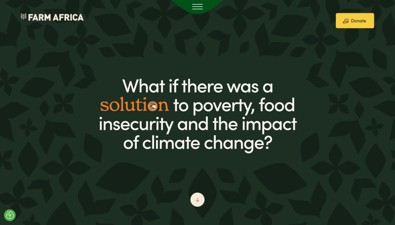
Farm Africa’s website, a 2025 Webby Award nominee, shows how thoughtful interaction design can amplify a charity’s mission. On the homepage, a scroll-based zoom draws users into the word ‘solution’ – literally focusing attention on the charity’s core aim of addressing poverty and food insecurity in rural Africa.
The site balances emotional storytelling with practical functionality. A streamlined top navigation dropdown enables task-focused users to quickly access key information without scrolling. This dual approach serves both exploratory and goal-oriented visitors, supported by intuitive information architecture that lets different user types engage with the site at their preferred depth. A filtering system makes it easier for visitors to navigate content by theme or country.
Visit Farm Africa’s website.
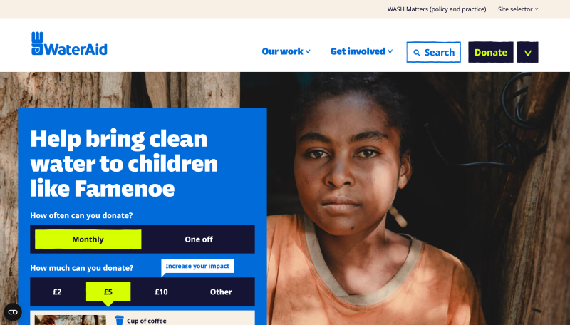
WaterAid
Obama Foundation
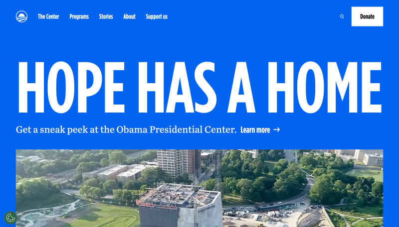
The Obama Foundation’s website, a 2025 Webby Award Winner, immediately communicates the organisation’s mission through a bold homepage banner and hero video.
As users scroll, the site introduces a distinctive split-screen interaction. A fixed content panel on the left anchors the narrative while the right-hand panel scrolls to reveal supporting imagery and information. It’s a design choice that creates a purposeful, immersive experience – one that reflects the Foundation’s focus on storytelling and civic engagement.
Despite the organisation’s wide-ranging work, a focused top navigation with five main sections keeps the site manageable.
Visit the Obama Foundation’s website.
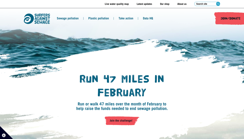
Surfers Against Sewage
Eden Reforestation Projects
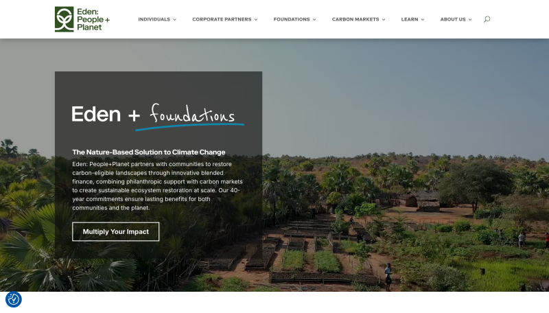
Visit Eden Reforestation Projects website.
Waves for Water
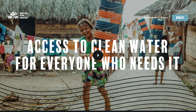
Visit Waves for Water’s website.
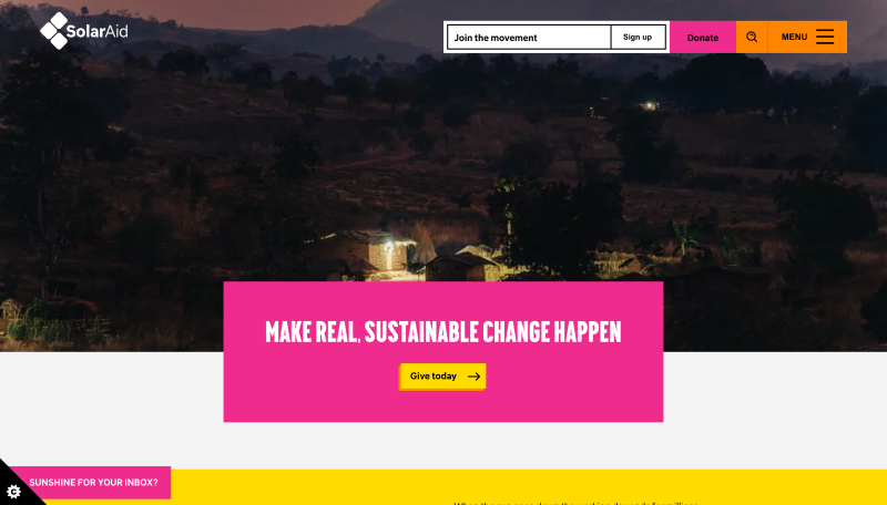
SolarAid