The best non-profit websites of 2023
We round up some of the most effective and stunning designs for non-profit's websites
A great purpose lies at the core of all great non-profits. But without a great way of communicating that purpose, you’ll be left unable to make the impact you seek as an organisation.
Non-profits and charities are hugely diverse, but their website always plays a key role in their success. It’s often the biggest way to get donations, deliver their mission, or in many cases, do both at once.
This means that clarity is key. Being able to provide a website that’s both visually captivating and easy to navigate is what makes the very best non-profit and charity websites stand out from the crowd.
Features of the best non-profit websites
There's no one-size-fits-all approach when it comes to excellent site design. However, we find the following attributes are key to creating the best charity and non-profit websites:
- Excellent user experience, underpinned by a well-thought-out information architecture.
- Effective storytelling that creates an emotional connection.
- Strong brand identity, combined with creativity in its use.
- Clarity on the key calls to action, and simple journeys to act on them.
- Visually compelling and distinctive design.
- Accessible and inclusive of a range of users.
With these factors in mind, here are our top 10 charity and non-profit websites for 2023:
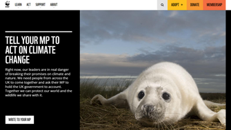
World Wildlife Fund
The World Wildlife Fund (WWF) is one of the world’s most recognisable and well-known charities. Their website combines excellent design with a well-structured information architecture. It appears to be very simple, but the site’s architecture comprises a wide array of different content, divided into the functionally named ‘Learn’, ‘Act’, and ‘Support’ menus.
The website delivers strong storytelling with excellent imagery to convey their mission and presents clear calls to action for users.
Visit the WWF’s website.
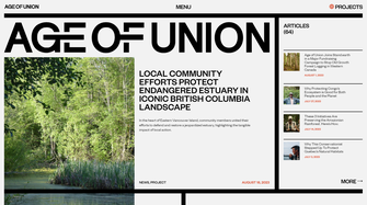
Age of Union
The Age of Union is an environmental charity with a bold, clear and visually impressive website. The typography, logo, and consistent use of the line element all work together to create a strong visual identity.
The site features excellent photography and knits great video assets into the page design seamlessly.
The site also takes the unusual step of indicating the number of pages in each menu section, giving the user an idea of how much content there is to explore. This wouldn’t work on all sites, but here it compliments the brand and supports the user’s exploration .
Visit Age of Union’s website.
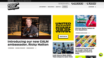
Campaign Against Living Miserably
CALM – the Campaign Against Living Miserably are a suicide prevention charity whose website is effective and easy to use. The layout is intuitive and makes effective use of negative space and striking colours are used sparingly to indicate where the user should pay most attention.
The site boasts a strong brand identity that permeates every page. It makes use of bold, clear typography that adapts to different requirements and underpins the visual identity.
The site also does a good job of using clear, compelling calls to action. The message ‘Donate £8 and help us answer a call for help’ effectively links the user to the purpose of their donation, giving it context that creates a sense of urgency that encourages donations.
Visit the CALM website
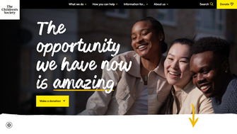
The Children’s society
The Children’s Society worked with Numiko to create their stunning and effective website. Their website successfully serves a variety of different user needs.
The website has over 4,000 pages, but the information architecture makes it frictionless to navigate. Calls to action are clear and donations are given context to boost conversion rates. The visual design uses carefully considered animations to add dynamism in a way that builds a strong brand identity.
We’re marking our own homework on this one, but we think The Children Society’s website is among the best non-profit websites in the UK.
Visit The Children’s Society’s website, or read our case study.
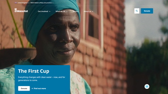
WaterAid
WaterAid’s website uses a strong hero video combined with excellent storytelling to create an engaging home page. Their information architecture helps structure and simplify their large and complex digital estate.
The site uses a combination of hard-hitting stats and storytelling to engage visitors with its mission. Donation calls to action are clear and accompanied by examples of how the funds will be spent, contextualising the charity’s mission for users and donors.
Visit WaterAid’s website.
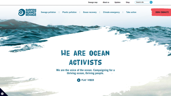
Surfers Against Sewage
Surfers Against Sewage is a non-for-profit campaign group with an excellent website with a strong and consistent visual identity. It includes an interactive map allowing you to check the water quality in your areas, cleverly connecting users to their purpose in a way that is highly relevant to them.
Visit the Surfers Against Sewage website.
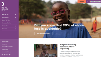
Helen Keller International
Helen Keller International’s website favours a left-hand menu that effectively maps out a large and complex website. It does a good job of organising and showcasing the content, and the site also has clear calls to action to donate. It opts for a positive approach that highlights the impact being made in its visual approach.
Visit Helen Keller International’s site.
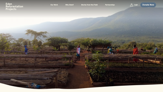
Eden Reforestation Projects
Eden Reforestation Projects’ website is another example of an impressive and captivating hero video.
The website does an excellent job of laying out its purpose and documenting their success with bitesize examples and digestible stats. There is ample information on their wide array of projects, but the site itself feels simple to navigate.
Visit Eden Reforestation Projects website.
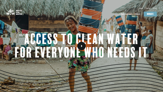
Waves for Water
Waves for Water is a charity dedicated to solving the global water crisis, and their website does an excellent job of taking users through their projects and purpose. Animations bring movement and dynamism to the site, and high-quality visuals make the site a captivating experience.
Visit Waves for Water’s website.
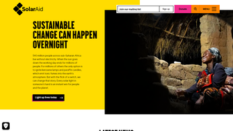
SolarAid
SolarAid employs a fun, interactive spotlight element that follows the cursor across images to illuminate them, playfully connecting the site’s design with its purpose. This is exactly the kind of creative thinking we love in website design.
The hamburger menu organises the content into three high-level areas, each with several subsections, which makes the site easy to navigate.
The calls to action are clear throughout and the donations section links well to real impact.
Visit SolarAid’s website.
We reveal the strategies that propel charity websites to new heights and connect those who need it most with a vibrant community of supporters.