A comprehensive visual brand refresh underpinned by technical modernisation and accessibility improvements
Context
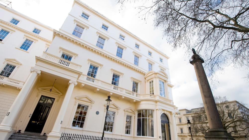
The British Academy is the UK's national academy for the humanities and social sciences. It champions research, funds projects around the world, and shapes public policy through evidence and insight.
We have a long-standing relationship with the British Academy. We built their website and have maintained it for several years. When the British Academy updated its visual brand identity, they turned to us to bring it to life digitally.
Challenge
The British Academy had developed a new visual identity with the twin aims of modernising their brand and improving the accessibility of their content. A strong application of the new brand to their website was vital to achieve this.
But this went beyond a visual refresh. The site needed major updates to key parts of the front-end framework and significant refactoring. All this work under the surface enabled a successful visual re-brand whilst also delivering accessibility improvements.
Approach
We delivered the project over five months, combining design, development, and accessibility review into a tightly coordinated series of sprints.
We started by creating a comprehensive new design system in Figma to underpin the refresh. This gave us a single source of truth for how the new brand should be applied consistently across the full site. From there, we worked methodically through every block, hero, and page type, redesigning and rebuilding each one. This was a considered rethinking of how each component should look and function, not a surface-level reskin.
New visual identity
The British Academy's refreshed visual identity, developed by Bond and Coyne, is refined and restrained, projecting a quiet confidence. Our role was to translate this identity into the digital space. We applied it across every component and page type, using the design system we created in Figma to ensure the brand is expressed consistently throughout the site whilst giving the Academy's content team the tools to use it flexibly.
The result is a site with a scholarly, almost editorial quality. Yet it retains a level of welcoming warmth through the use of softer colours, so it remains approachable. Generous spacing and serif type on page titles create a sense of authority and calm that suits an institution of this stature.
Accessibility
A lot of effort was put into how text renders on different devices. The British Academy site is text heavy, and it is vital it was easy for all readers to comfortably take in the information on the pages.
Block-level accessibility improvements were part of the brief from the outset. Our QA team conducted a full review across all twenty-seven content types as each was built, raising and resolving issues throughout the sprint rather than leaving them to a single pass at the end. This means the refreshed site doesn't just look better, it works better for everyone.
What the client says
“Numiko had been working on the site for years, so they knew what we needed to do and were quickly able to get going on the project. Numiko’s translation of our updated brand to a digital medium was strong from the first iteration. It was then easy to collaborate over short sprints. Accessibility and readability are core to our needs and I could trust Numiko to deliver this for us.”