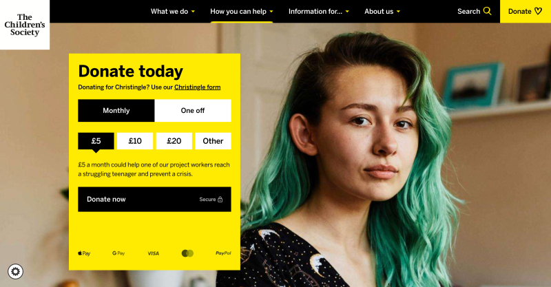
We created a more user-friendly website to improve audience engagement and donation rates.
Context
The Children's Society aims to reverse negative trends in youth well-being. By working one-to-one with the most vulnerable children and amplifying their voices, they strive to inspire a movement that seeks societal change, fostering hope for the future of all children. We were enormously proud to work with The Children’s Society as their digital agency. Like a great deal of our work, this project really matters, and we took our role very seriously.
Challenge
The society needed a new website that was more user-friendly to improve audience engagement and, crucially, donation rates. The overall page count needed to be significantly reduced (from 15,000 to 4,000) making the site more focused and easier to navigate. The website also required an aesthetic overhaul and to be optimised for mobile.
Approach
We introduced a bold and optimistic design for the new website leveraging large-scale, impactful imagery and a custom typeface to centre the voices of young people. We incorporated movement into our designs, maintaining a sense of vertical rhythm on every page and ensuring this tactile sense of movement was compatible with all devices.
To streamline the content pages, we established a new content model that aligned key information with critical user journeys. We also implemented a conversion rate optimisation strategy targeting key audience segments, aiming to increase engagement across three main pillars: education, inspiration, and investment.
Following extensive user testing and refinement, we launched the new website. It aimed to educate users about the issues facing young people, inspire change through authentic stories, and encourage investment, either through donations, volunteering, or support for online campaigns.
Results
Results
The number of users making a donation increased by 636%, demonstrating the efficacy of the user journeys we developed.
The donation completion rate increased by an astounding 1322%, demonstrating how simple and intuitive it is to use the donation system we implemented.
The bounce rate decreased by 47% demonstrating that users were finding content of relevance to them, and therefore staying on the website.
The redesigned website was received positively by users with 80% of repeat visitors asserting its improvement over the previous site
Donation journey optimisation
After launching the new site, we rolled up our sleeves for the next challenge: further boosting donations. To do this, we ran a focused optimisation project testing a variety of different approaches and saw what really worked.
We had three main areas to tackle: making donation opportunities more visible and accessible, crafting messaging that genuinely motivated people to act, and giving the donation components a much-needed design refresh. We tested everything from sticky navigation headers to button text, slice positioning, and different persuasive messaging techniques.
The breakthrough came when we moved the donation slice from its buried position halfway down the page right up to the hero section. This test hit 90% statistical significance and showed clear improvements in how people engaged with the page.

We also redesigned the donation component to make choosing between one-off and regular donations much clearer, and added messaging that highlighted how many others were already supporting the cause, providing that all-important element of social proof.
Over the course of four months, we implemented all the winning changes from our testing: Moving that crucial donation slice to the top of the page, and rolling out a new donation slice design and implementing a sticky header.
Enhanced results
The donation journey optimisation work paid off for The Children's Society. When we compared performance with these tweaks live vs against the same period the previous year, we saw significant results, including:
- 57% increase in engaged sessions on the donate page
- 17% increase in one-time donations
- 11.9% increase in regular donations
These increases are on-top of the large donation increases already delivered by The Children’s Society’s new website. They show that taking a systematic, data-driven approach to optimisation can help charities connect with more people who want to make a difference, and crucially, get them to donate.
What the client says
“Our new website is designed to inspire a new generation of people who want to join us in building a society for all children. It amplifies young people’s voices and their stories of hope. Our design is simple and easy to use so everyone can play their part in restoring young people’s hope when it’s threatened by neglect, abuse or exploitation.”