How charity websites can drive donations whilst serving users in need.
Introduction
Charity websites often have to perform a range of different roles simultaneously. They need to serve the users of the charity's services, who are there to access information or support, whilst also engaging supporters and driving them to take action, either by donating, fundraising or volunteering. These are very different user groups with very different needs, so it's a perennial challenge for the sector.
Every charity website, like every charity, is unique, so each must approach this challenge in its own way based on the needs of its users. However, our experience designing charity websites to address these issues has led us to develop some useful rules of thumb and ways of approaching the problem.
The challenge
UX issues can arise whenever a website must serve multiple sets of users with very different needs. This is particularly difficult for charities who may have service users that are in crisis or dealing with extremely challenging circumstances.
Macmillan Cancer Support is an example of a charity whose website must serve both service users (cancer patients and families needing support) and supporters (those looking to fundraise, donate or volunteer).
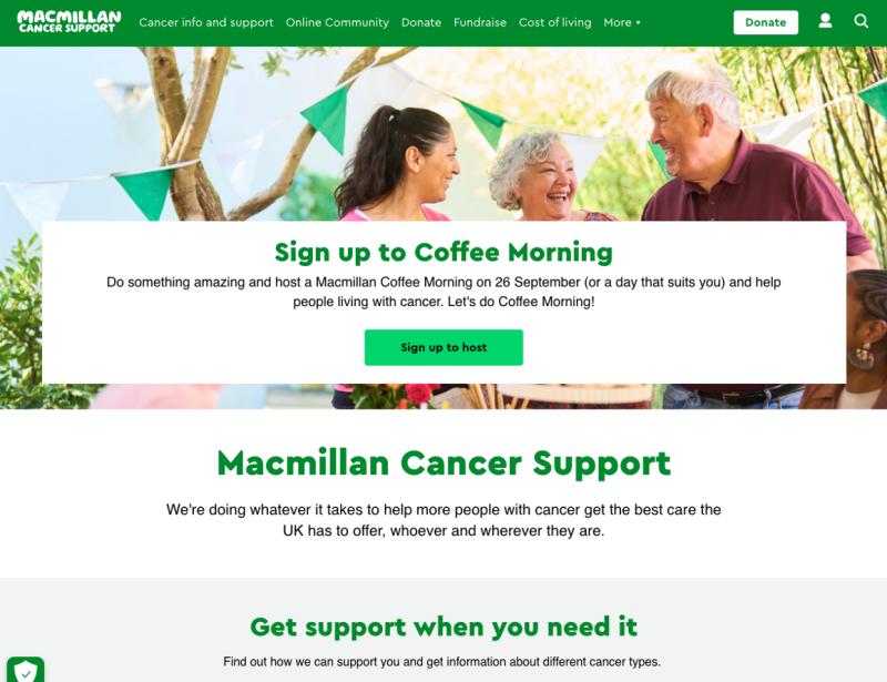
Macmillan’s website attempts to serve both with approximately equal priority. The first item in their information architecture is 'Cancer info and support', serving the needs of service users, whilst the hero at the top of their homepage focuses on fundraising activities.
The issue with serving very different user groups is that they ideally should be handled differently. Content for supporters, which may be seeking to drive donations, generally needs to be positive (look at the good you can do) and direct (donate now). Service users will need content with a softer, calmer tone. Depending on the charity, service users may be arriving in a state of distress or be in crisis, so information should be clear, simple and straightforward.
It's important to not let well-meaning information about fundraising or events crowd out service provision on your website. Losing sight of the needs of service users ends up letting down your charity's real mission.
In the example below from the charity 'Mental Health UK', you'll see that CTAs around fundraising events are drowning out the charity's core mission of serving users in crisis.
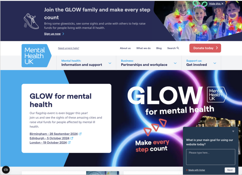
This page ranks highly for the search term 'mental health support', so it's likely that users in urgent need of support with their mental health are landing on the page.
Whilst the page does include a link titled 'Need urgent help', it's not what initially stands out to a user. In this instance, this website has put the cart before the horse and allowed events and fundraising to take priority over the needs of service users.
It is worth noting that this screenshot is from over a year ago, and Mental Health UK’s website has partially redressed this balance.
Break down silos
Serving different sets of users always presents web design challenges, but these are often magnified for charity websites because it is common for separate teams within the charity to manage donations and service provision.
Teams working in their own silos, pursuing their own narrow set of objectives, can cause charity websites to be disjointed, worsening the user experience and making them less effective.
You need to ensure internal teams are aligned on what the objectives are, and they all need to be bought into a shared vision for the project. This means when difficult decisions arise, they can make the right trade-offs to support the organisation's overall mission.
For more information on creating a shared vision, see our article: How and why to establish a digital vision.
Service users first
You need donations. They are the lifeblood of your charity. You're under pressure and you've got targets to hit. All these factors mean that over time the needs of service users can get lost.
You need to be aware of this tendency and push back against it. We think that charity websites can serve both sets of users effectively but that the ones who do this best consciously prioritise the needs of service users.
There is a simple reason for this. Service users need to access support quickly, whereas supporters can benefit from understanding how you impact the lives of service users.
Successfully prompting donations requires more than an eye-catching call to action. You must first engage and convince supporters that their money will make an impact.
Teenage Cancer Trust's website shows how a website can successfully serve both sets of user needs by prioritising service users.
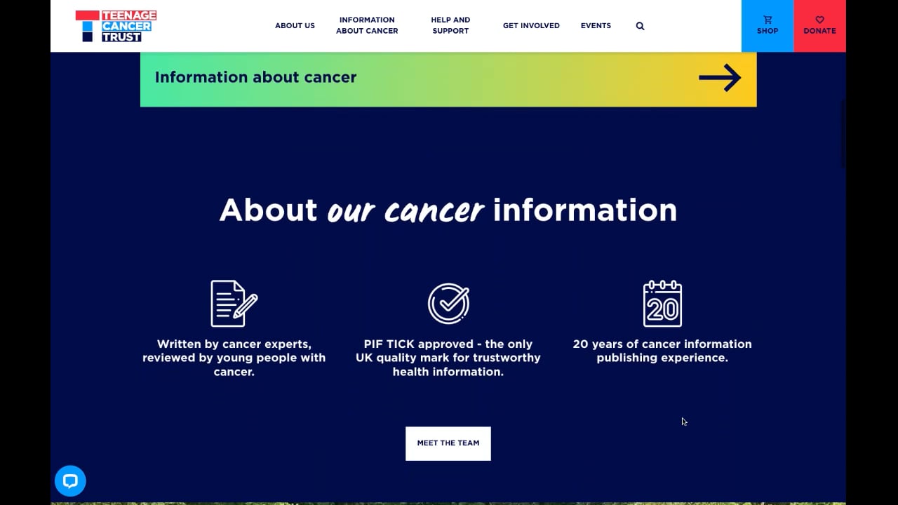
Whilst the website features strong donation calls to action and information for supporters on getting involved, it's clear at a glance that the priority is given to users in need of advice and support.
This priority is evident in the information architecture; 'Information about Cancer' and 'Help and support' come before 'Get involved' as one reads left to right. It is also apparent in the homepage layout. CTAs for 'Help and Support', 'Our cancer units', and 'Information about cancer' are given priority before the 'get involved' teasers.
The result is a website that's clear in its purpose and effective for service users whilst being persuasive for supporters. Supporters donate so that the charity can help its users, so by serving service users effectively you’re also demonstrating your value to supporters.
The importance of story content
Whilst donation, volunteering or fundraising content isn't especially useful to service users, there are some content types that are valuable for both sets of users simultaneously. The most crucial of these are user stories. We recommend capitalising on this by making story content a major focus.
Teenage Cancer Trust's website also shows how story content can serve both groups effectively. Stories from people helped by the charity showcase the uplifting journeys these service users have been on, which can both be heartening for other service users and create an emotional connection with supporters by demonstrating impact. This then sets up supporters to be more likely to donate or get involved.
The website we created for the Children's Society demonstrates how charities can harness story content to convey the impact they have, inspiring service users and simultaneously driving donations.
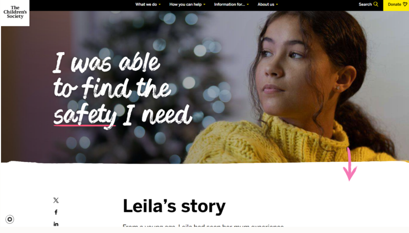
Individual story pages guide visitors through personal journeys that illustrate life-changing outcomes. This creates emotional engagement that motivates users toward concrete actions like making donations.
Personal accounts also function as compelling entry points to draw visitors further into your content. Teasers such as "Discover Sam's Journey" spark interest and prompt users to explore more. This technique works particularly well on homepages or within email outreach, encouraging deeper exploration of your mission.
For more information on using stories to convey your charity's impact and drive donations, see our article on how to convey impact with your website.
Delineate with your Information Architecture
Whilst story content can be served to both service users and supporters, most of the time content is only going to be relevant to one or the other group.
That makes it vital that your information architecture clearly signposts users to the right sections for them. For this reason, charities can often benefit from implementing an audience based information architecture. This divides the site by what the user is there to achieve.
Our design for Anthony Nolan's website is a perfect example. Their IA clearly signposts sections for those who wish to 'Help save a life' and those who are there to receive help under 'For patients and families'.
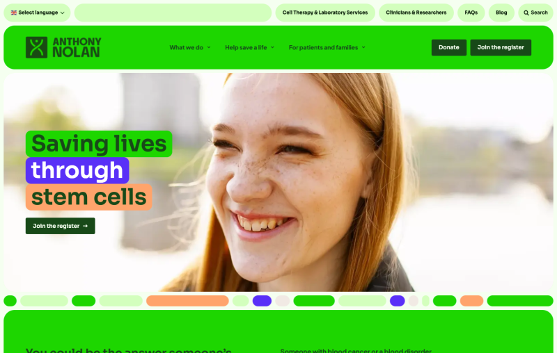
Effective delineation means you can focus your messages to where they'll make the most impact. Having a clear section for service users (like Anthony Nolan's 'For patients and families') means you can keep that section free from donation CTAs that might impair the experience of service users. This frees you up to focus on creating compelling and clear donation CTAs in the parts of your site clearly designed for supporters, because you know you won't be bothering service users with them.
Next steps
If your charity website serves both supporters and service users, we recommend you start by ensuring your internal teams are all aligned and share a vision for the website. Everything flows from this, because if your teams are working in silos, pursuing their own metrics at the expense of the big picture, no amount of great web design can create an effective site.
Once that shared vision is established, embark on user research to deeply understand how users are interacting with your site and what they are there to achieve. Arrange user interviews to understand how supporters want to help, and understand the barriers they face to doing so. Dig into any problem areas with the site that analytics show users are dropping off at. Probe what's causing this drop-off to get to the root of how the site can be improved.
Based on our experience, we find that prioritising service users, investing in compelling story content, and using an audience-based information architecture are usually the right way to go. As every charity website is unique, you'll need to uncover the right answers for your audience with research and testing.
Our team can help with any or all of this. We've designed and built effective charity websites for many of the UK's leading charities. If you'd like our help crafting a website that can meet the needs of service users and effectively drive donations, get in touch. We’d love to talk.